
Above the fold content is the portion of a webpage visible without scrolling, and it is the single most consequential real estate on your site. Visitors decide within seconds whether to stay or leave, and that decision happens entirely within this first viewport. The highest-leverage change you can make right now: replace a vague or generic headline with one that states exactly what you do and whom you serve.
A strong above-the-fold structure looks like this:
- Headline: "Custom Websites for Indiana Contractors — Built to Win Calls"
- Supporting line: "Hand-coded, fast-loading sites that rank locally and convert visitors into leads."
- Primary CTA: "Get a Free Quote" button, high-contrast, placed immediately below the subheadline
- Hero visual: A clean image of a finished project or a professional working, cropped to load fast
Pro Tip: Run Google PageSpeed Insights on your homepage right now. If your Largest Contentful Paint (LCP) score is above 2.5 seconds, your hero image or headline is loading too slowly to hold attention — that is your first fix.
Key Takeaways
Above-the-fold content sets the conversion outcome for your entire page — get the headline, CTA, and load speed right before optimizing anything else.
| Point | Details |
|---|---|
| Attention drops 84% at the fold | NNGroup research shows content above the fold receives dramatically more engagement than content below it. |
| One headline, one CTA | Keep the initial viewport focused: one clear headline, one subheadline, one primary CTA, and one trust signal. |
| LCP and CLS are fold-driven | Your hero image and headline set your Core Web Vitals scores — preload critical assets and set image dimensions to prevent layout shifts. |
| Test the headline first | Headline A/B tests produce the highest variance in conversion impact of any single above-the-fold element. |
| Kirk-co builds performance-first | Kirk-co's hand-coded sites inline critical CSS, preload hero assets, and defer scripts to maximize first-viewport speed. |
Table of Contents
- What is above the fold content, and where did the term come from?
- Why does above-the-fold placement still matter for conversions?
- How do you measure where your fold is and test what works?
- How should you design above-the-fold content for mobile-first layouts?
- What are the best practices for above-the-fold design?
- How do above-the-fold choices affect your SEO and Core Web Vitals?
- What do strong and weak above-the-fold examples actually look like?
- How Kirk-co builds above-the-fold performance into every site
- Your prioritized action plan for this week
- The tradeoffs no one talks about
- Kirk-co builds sites where the first viewport does the work
- Sources
What is above the fold content, and where did the term come from?
The phrase comes from print newspapers. Broadsheets were folded in half for display on newsstands, and editors placed the most important stories above that physical crease to catch a buyer's eye. When web designers adopted the metaphor in the 1990s, "the fold" became the bottom edge of the browser window — the point where a page disappears until you scroll.
Optimizely defines above the fold as the portion of a webpage visible without scrolling, and that definition still holds. What has changed is the fold's location. On a 1080p desktop monitor, the fold might sit around 900 pixels down. On a smartphone in portrait mode, it can be as low as 500–600 pixels. On a tablet, somewhere in between. There is no single pixel height that works for every visitor.
Nielsen Norman Group's eyetracking research found an 84% average difference in how users engage with content above versus below the fold. The 100 pixels just above the fold receive substantially more visual attention than the 100 pixels just below it. That gap is not a rounding error — it is the core reason content placement strategies matter so much.
Why does above-the-fold placement still matter for conversions?
The short answer: users scroll only when the top of the page earns it. If your initial viewport does not communicate clear value, most visitors leave before they ever see your pricing, your testimonials, or your contact form.
NNGroup's aggregate research confirms that the dramatic attention drop at the fold is consistent across device types and page categories. Users will scroll, but only when the above-the-fold content gives them a compelling reason to continue. A vague headline or a slow-loading hero image removes that reason immediately.
Ad viewability follows the same pattern. Wikipedia's synthesis of Google's display ad viewability analysis cites studies showing viewability rates notably higher for ads just above the fold compared with ads just below it — a gap that directly affects ad revenue for publishers and reinforces why placement decisions carry real financial weight.
Better Ads Standards identify specific ad formats that degrade the initial viewport experience, including large sticky ads, full-page interstitials, and auto-playing video ads with sound. Placing any of these above the fold increases bounce rates and reduces the perceived quality of your page.
Semrush's guide reinforces this: heavy or poorly optimized above-the-fold assets directly increase bounce rates, while a fast, clear initial viewport improves both engagement and conversion.
Pro Tip: Place your primary value proposition and your main CTA above the fold on every key landing page. Supporting evidence — testimonials, feature lists, pricing — belongs below. Users who scroll that far are already interested; give them confirmation, not a second pitch.
How do you measure where your fold is and test what works?
You cannot optimize what you have not measured. Start by pulling your device breakdown from Google Analytics or a similar tool.
To determine your practical fold:
- Check your analytics for the top device categories (mobile, tablet, desktop) and their screen resolutions.
- Use Chrome DevTools' device emulator to preview your page at the most common viewport sizes.
- Run a heatmap tool like Hotjar or Microsoft Clarity to see where users actually stop scrolling.
- Note where your sticky header ends — that space counts against your visible fold height.
Step-by-step testing checklist:
- Identify your single most important CTA (usually "Get a Quote," "Book a Call," or "Shop Now").
- Confirm it appears above the fold on your top two device types.
- Set up an A/B test in a tool like Optimizely, changing only the headline text in variant B.
- Run the test until you reach statistical significance (most tools flag this automatically).
- Check scroll depth in your analytics to see whether the new headline drives more users past the fold.
- Measure CTA click rate, bounce rate, and dwell time before and after.
Metrics worth tracking: bounce rate, scroll depth percentage, CTA click-through rate, LCP, Cumulative Layout Shift (CLS), and average session duration. Each one tells a different part of the story.
Pro Tip: Session recordings in tools like Microsoft Clarity show you exactly where users hesitate or rage-click. Watch five recordings before you write your next A/B test hypothesis — you will spot problems no analytics dashboard would surface.
How should you design above-the-fold content for mobile-first layouts?
Google uses mobile-first indexing, which means the mobile version of your page is the one Google evaluates for ranking. Your mobile fold is not a secondary concern — it is the primary one.
The mobile fold is tighter than most designers expect. A typical smartphone in portrait mode gives you a limited height of visible area after accounting for the browser's address bar and any sticky navigation. A full-screen hero image that looks dramatic on desktop can consume the entire mobile viewport, pushing your headline and CTA completely out of sight.
Mobile-first rules to follow:
- Keep your sticky header under 60px tall so it does not eat into fold space.
- Use CSS
min-height: 100svh(small viewport height) rather than100vhto account for mobile browser chrome. - Place your headline and CTA in the top half of the hero section, not centered vertically — on small screens, centered content often falls below the fold.
- Test hero images at 375px, 390px, and 430px widths (the most common iPhone viewport widths as of 2025).
- Avoid full-screen video backgrounds on mobile; they increase LCP dramatically and often autoplay issues arise.
Responsive design does not mean one layout that shrinks. It means a deliberate hierarchy that reorders content for each breakpoint. Your mobile layout should show the headline first, the CTA second, and the hero visual third — even if the desktop layout places the visual alongside the text.
Pro Tip: After any design change, check your page on a real device, not just an emulator. Browser chrome behavior, font rendering, and tap target sizes all differ from what DevTools shows.
What are the best practices for above-the-fold design?
The goal is clarity, not creativity. Every element above the fold should serve one purpose: convince the visitor that they are in the right place and that the next step is obvious.
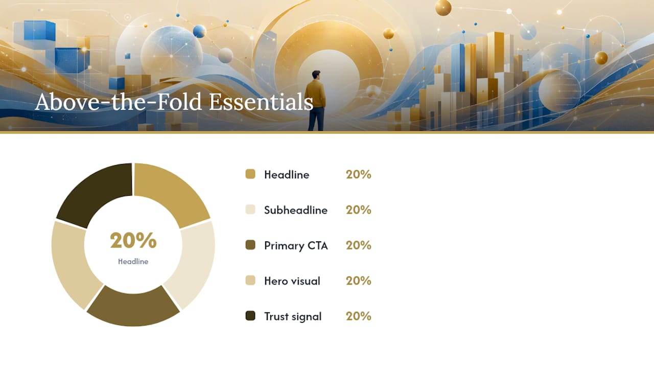
Omniconvert's best-practices guide recommends a tight set of elements: one headline, one subheadline, one primary CTA, a relevant hero visual, and light trust signals (a logo strip, a star rating, or a single short testimonial). That is it. Anything beyond this competes for attention.
Prioritized checklist:
- Headline first. Write it to answer "What do you do and for whom?" in under ten words.
- Subheadline second. Add one sentence of supporting context or a key benefit.
- CTA third. Use a button with a specific label ("Get My Free Quote") rather than a generic one ("Submit"). Strong CTA copy and placement consistently outperforms vague button labels in A/B tests.
- Hero visual fourth. Choose an image that reinforces the headline — a finished project, a happy customer, or a product in use.
- Trust signal fifth. One small element: "Trusted by 200+ Indiana businesses" or a Google rating badge.
What to avoid:
- Navigation menus with more than six items — they create decision paralysis.
- Auto-playing carousels with multiple slides — they dilute focus and slow load time.
- Stock photography that looks generic — it signals low effort and reduces trust.
- More than one primary CTA — two buttons of equal weight split attention and reduce clicks on both.
Shopify's guidance on above-the-fold design emphasizes responsive layouts and headline clarity as the two highest-impact variables for small-business landing pages, with A/B testing as the method to confirm which version actually converts better for your specific audience.
Pro Tip: Test your headline before you test anything else. It has the highest variance in conversion impact of any single above-the-fold element — a headline change can move conversion rates more than a full visual redesign.
How do above-the-fold choices affect your SEO and Core Web Vitals?
Your initial viewport directly sets two of Google's Core Web Vitals: Largest Contentful Paint and Cumulative Layout Shift. Both are ranking signals.
LCP measures how long it takes for the largest visible element in the viewport to render. On most pages, that element is the hero image or the H1 headline. A large, unoptimized hero image — say, a 3MB JPEG — can push LCP past 4 seconds, which Google classifies as "poor." The fix is a combination of image compression, modern formats (WebP or AVIF), and resource preloading.
CLS measures how much the page layout shifts during load. Ads that load after the page renders, images without defined dimensions, and web fonts that swap after initial paint all cause CLS. A high CLS score means your CTA button moves just as a user tries to click it — a frustrating experience that increases bounce rate.
MDN's documentation on rel="preload" explains how to tell the browser to fetch critical above-the-fold resources — your hero image, your primary font — before it processes the rest of the page. This is one of the fastest practical ways to improve first-paint metrics.
Developer checklist:
- Preload your hero image with
<link rel="preload" as="image">in the<head>. - Set explicit
widthandheightattributes on all above-the-fold images to prevent CLS. - Inline critical CSS for above-the-fold styles; defer the rest.
- Defer all non-critical JavaScript with the
deferattribute. - Avoid placing large ad units above the fold that load asynchronously and shift content.
- Use Google PageSpeed Insights or Lighthouse to audit LCP and CLS after every major change.
Semrush's performance guidance ties these technical choices directly to search rankings and conversion: a faster, more stable initial viewport reduces bounce and signals quality to Google's crawlers. Faster website speed compounds that benefit across both organic rankings and paid ad quality scores.
What do strong and weak above-the-fold examples actually look like?
Seeing the contrast between a well-built and a poorly built initial viewport makes the principles concrete.
Strong example — local service business homepage:
- H1: "Plumbing Repairs in Indianapolis — Same-Day Service"
- Subheadline: "Licensed, insured, and available 24/7. Call us and we'll be there."
- CTA button: "Call Now: (317) 555-0100" — high-contrast, above the fold on mobile and desktop
- Hero image: A technician at work, compressed to under 150KB in WebP format
- Trust signal: "4.9 stars — 312 Google reviews" directly below the CTA
Every element earns its place. The visitor knows what the business does, where it operates, and what to do next — all without scrolling.
Weak example — common mistakes:
- H1: "Welcome to Our Website" — tells the visitor nothing
- Hero: A 4MB full-screen video that takes 6 seconds to load on mobile
- Two CTAs of equal size: "Learn More" and "Contact Us" — neither stands out
- Navigation with 10 items, a language selector, and a search bar — visual noise before the value proposition
Mini-templates for common page types:
- Lead-gen landing page: Headline + benefit subheadline + form (first name, email, phone) + one trust signal. No navigation. No footer links. One job only.
- Small business homepage: Headline + subheadline + primary CTA button + hero image + logo strip or review badge. Navigation kept minimal.
- Service page: Service name as H1 + one-sentence outcome statement + "Get a Quote" CTA + a relevant project photo. Supporting details start below the fold.
Pro Tip: Screenshot your above-the-fold view on both a desktop and a phone, then show it to someone unfamiliar with your business. Ask them: "What does this company do?" If they cannot answer in five seconds, your headline needs work.
How Kirk-co builds above-the-fold performance into every site
Kirk-co's approach to above-the-fold content starts at the code level, not the design level. Every site Kirk-co builds is hand-coded from scratch, which means there is no page-builder bloat, no unused CSS framework, and no third-party widget loading in the critical path.
For the initial viewport, Kirk-co inlines only the CSS needed to render the hero section, headline, and CTA — typically a fraction of the full stylesheet. The hero image is pre-optimized in WebP format with explicit dimensions set in the HTML, eliminating CLS before the page even loads. Scripts that are not needed for the first paint are deferred. The result is a first viewport that renders fast and stays stable, which directly improves LCP and CLS scores in Lighthouse.
Kirk-co's portfolio of live Indiana business websites shows this approach applied across contractors, home service providers, and retail businesses. Each project prioritizes a clear headline, a single CTA, and a fast-loading hero — the same structure this guide recommends.
Pro Tip: Ask any web developer you are considering to show you a Lighthouse score for a site they built. A well-optimized above-the-fold build should score 90 or above on Performance in Google's Lighthouse audit. That number is a direct proxy for how fast your first viewport loads.
Your prioritized action plan for this week
You do not need a full redesign to improve your above-the-fold content. Start with the highest-impact changes and measure before moving to the next.
Quick wins (do these today):
- Rewrite your homepage headline to answer "What do you do and for whom?"
- Move your primary CTA button above the fold if it is currently below it
- Compress your hero image using a tool like Squoosh or TinyPNG and convert it to WebP
High-impact tests to run first:
- A/B test two headline variants using Optimizely or a similar tool. Run for at least two weeks or until statistical significance is reached.
- Add
rel="preload"to your hero image and measure the LCP change in PageSpeed Insights before and after. - Record five user sessions with Microsoft Clarity or Hotjar. Note where users stop and whether they click the CTA.
When to bring in a developer:
- Your LCP is above 2.5 seconds and you cannot identify the cause in PageSpeed Insights.
- Your CLS score is above 0.1 and layout shifts are happening in the hero section.
- Your current site is built on a page builder and you cannot control critical CSS or resource loading order.
- You want a conversion-focused website design built to perform from the first pixel, not patched after the fact.
Pro Tip: Run your PageSpeed Insights audit on mobile, not desktop. Google's mobile score is the one that affects your search rankings, and it is almost always lower — which means it is where the biggest gains are hiding.
The tradeoffs no one talks about
Most guides on above-the-fold design present the principles as if they are frictionless to implement. They are not. Real projects involve competing priorities, and knowing where to hold firm makes the difference between a site that performs and one that looks good in a mockup.
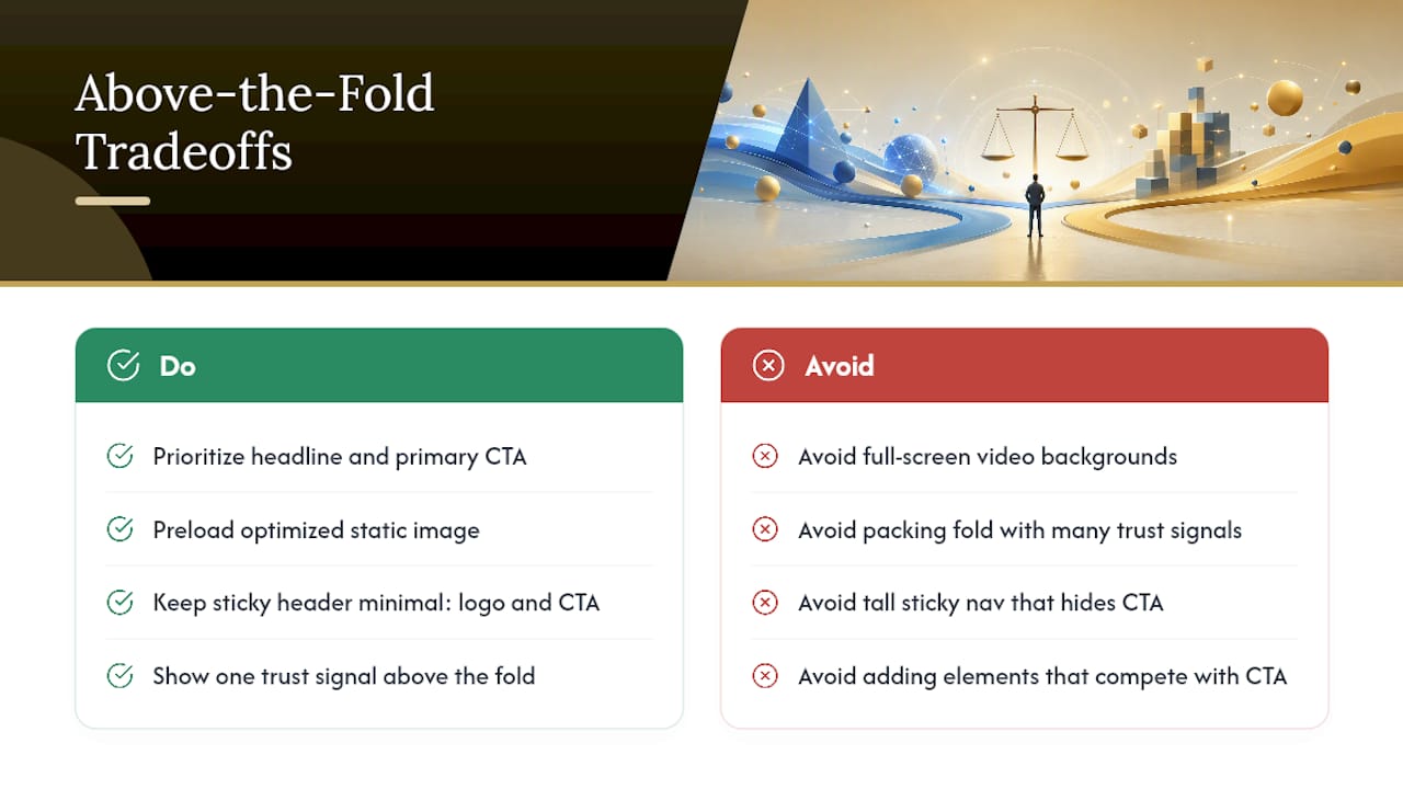
The most common conflict: a client wants a large, cinematic hero video because a competitor has one. The problem is that full-screen video backgrounds are among the worst offenders for LCP on mobile. A 10-second video that communicates brand personality costs you 3–4 seconds of load time and a poor Lighthouse score. A well-chosen static image, optimized and preloaded, communicates the same personality in 200 milliseconds. The visual impact is lower; the conversion impact is higher.
Sticky navigation is another genuine tradeoff. A persistent nav bar helps users move around a site, but on mobile it can consume 60–80 pixels of fold space. That is the difference between your CTA being visible on a small phone or sitting just below the fold. Kirk-co's approach is to keep sticky headers minimal — logo and one CTA button only — so the fold stays productive.
Marketing teams often want to pack the fold with trust signals: review counts, certification badges, partner logos, and a newsletter signup. Each addition is individually reasonable. Together, they create visual noise that dilutes the primary CTA. The discipline is to pick one trust signal and place the rest below the fold where users who are already engaged will find them.
The underlying principle: every element you add above the fold competes with your CTA for attention. Treat fold space as a budget. Spend it on the headline, the CTA, and one supporting element. Save everything else for the scroll.
Kirk-co builds sites where the first viewport does the work
Your above-the-fold content should convert visitors before they scroll. Kirk-co builds custom, hand-coded websites for Indiana businesses where every line of code is written to make that first viewport load fast, display clearly, and drive action. No templates, no page-builder overhead, no bloated scripts slowing your hero section down.
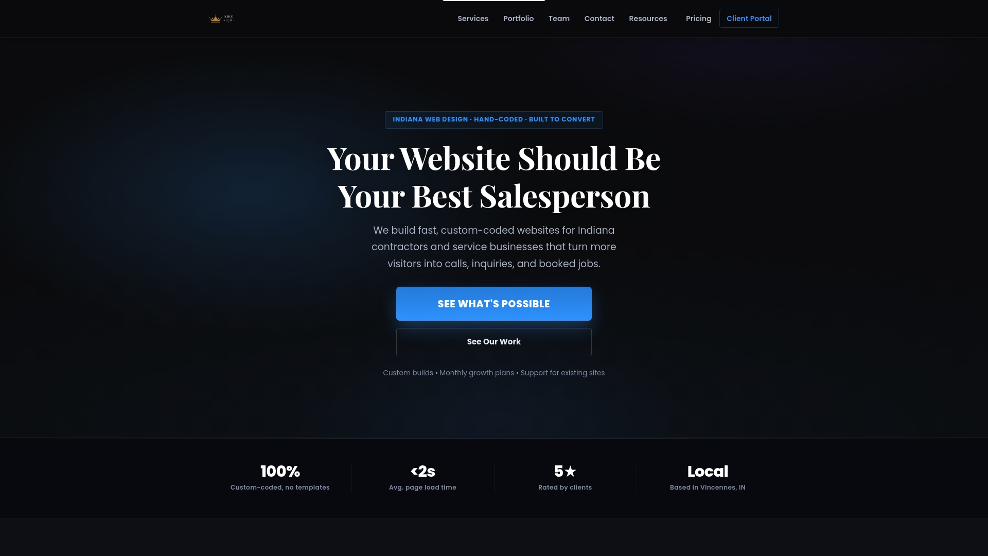
Every Kirk-co build includes a performance-first above-the-fold structure: an optimized headline, a single high-contrast CTA, a compressed hero image with preload, and inlined critical CSS. The result is a site that scores well in Lighthouse and converts visitors into leads. Kirk-co also offers ongoing maintenance and support plans to keep your site performing as devices and browsers evolve. See the pricing and plans or reach out to start a conversation about your site today.
Sources
The research and tools referenced throughout this guide are worth bookmarking if you plan to go deeper on any specific area.
- The Page Fold Manifesto - Nielsen Norman Group
- Semrush — Above the Fold (guide)
- Omniconvert — Above the Fold: Examples, Elements & Best Practices
- Better Ads Standards