
The highest-impact levers to improve website conversions are page speed, a clear above-the-fold value proposition, prioritized A/B testing, friction removal in forms and checkout, and trust signals placed at decision points. You do not need more traffic to see more results; you need to extract more value from the visitors already arriving. With AI-driven search reducing organic click volume for many sites, conversion rate optimization (CRO) is now the highest-ROI move for most marketers.
Start here before anything else:
- Run a Lighthouse audit on your top landing page and fix any Core Web Vitals failures
- Rewrite your hero headline to name a specific outcome for a specific person
- Replace every vague CTA ("Learn More," "Submit") with a benefit-driven phrase ("Get My Free Quote")
- Remove all non-essential fields from your primary lead form
- Add one trust signal (a review snippet, a security badge, or a guarantee) directly above your CTA
Most of these take hours, not weeks. Measurement matters just as much as execution. Set a baseline conversion rate before you change anything, run changes for at least two weeks, and track funnel drop-off at each step. You will know within a quarter whether your efforts are compounding.
Table of Contents
- Set one conversion goal and the KPIs that prove progress
- Your above-the-fold message does more work than your design
- Landing page design and CTA architecture that keep visitors focused
- Remove friction from forms, checkout, and navigation
- Analytics, heatmaps, session recordings, and prioritized A/B testing
- Ecommerce-specific levers that reduce cart abandonment
- How long changes take to show impact and what they cost
- How a performance-first website rebuild drives real conversion gains
- Personalization strategies that tailor experiences to visitor behavior
- Customer feedback and user testing as qualitative conversion tools
- Optimize your traffic sources to attract higher-converting visitors
- Key Takeaways
- The case for treating CRO as infrastructure, not a campaign
- Kirk-co builds Indiana websites designed to convert from day one
- Sources and tools to go deeper
Set one conversion goal and the KPIs that prove progress
Trying to optimize for everything at once optimizes for nothing. Pick one primary conversion goal: a phone call, a form submission, a purchase, or a demo signup. Every test and every design decision should serve that single goal.
Once you have your goal, track the minimum metric set that tells you whether you are moving it.
| KPI | What it measures | Simple formula |
|---|---|---|
| Conversion rate | Share of visitors who complete the goal | Conversions ÷ Sessions |
| Funnel drop-off | Where visitors leave before converting | Sessions at step A minus sessions at step B |
| Average order value (AOV) | Revenue per transaction | Total revenue ÷ Number of orders |
| Customer acquisition cost (CAC) | Cost to acquire one customer | Total spend ÷ New customers |
| Lifetime value (LTV) | Long-term revenue per customer | AOV × Purchase frequency × Retention period |
Benchmark ranges give you a realistic target: Global averages sit around 2–4%, top-quartile sites convert at roughly 5.3%, and elite performers reach 11.5% or higher. Most B2B websites convert a low single-digit percentage of organic visitors. If you are below 2%, you have a clear gap to close before worrying about traffic volume.
Set your baseline by pulling recent data from Google Analytics 4 or a comparable analytics platform. Record your current conversion rate, funnel drop-off at each step, and your top traffic sources. Use a sufficient pre/post comparison period with stable traffic to reliably measure impact.
Your above-the-fold message does more work than your design
A clear value proposition above the fold converts more visitors than any cosmetic layout change. Visitors decide within seconds whether your page is relevant to them. If your headline is vague, they leave. If it names their problem and your solution in plain language, they read on.
Here is the difference in practice:
- Vague: "Welcome to our website. We help businesses grow."
- Specific: "Custom websites for Indiana contractors that load fast and bring in more calls."
The specific version tells the visitor who you serve, what you deliver, and what outcome they get. That is the job of your headline. Your subhead adds one supporting detail (how you do it, or why it works). Your primary CTA names the next step.
Every above-the-fold section should answer four questions:
- What do you offer?
- Who is it for?
- What outcome does the visitor get?
- What should they do next?
Headline and CTA copy changes are among the highest-leverage quick wins available — start testing messaging before redesigning layouts. A rewritten headline costs nothing to test and can move conversion rates significantly. Microcopy matters too. "Get My Free Quote" outperforms "Submit." "Start My Free Trial" outperforms "Sign Up." The verb and the possessive pronoun ("My") both signal that the action belongs to the visitor, not to you.
Landing page design and CTA architecture that keep visitors focused
Campaign traffic should never land on your homepage. A dedicated landing page built around one conversion action consistently outperforms a general page because it removes every competing option. Single-goal landing pages designed to match visitor intent convert at higher rates than generic pages, and the gap widens when the page headline matches the ad or email that sent the visitor there.
The layout heuristics that hold up across industries:
- Remove the main navigation from campaign landing pages
- Repeat the primary CTA at least twice (above the fold and after your proof section)
- Keep the page focused on one offer; every element either supports the conversion or it should not be there
- Use directional cues (arrows, eye-gaze in photos, whitespace) to guide attention toward the CTA
CTA architecture has two tiers. Your primary CTA is the main conversion action: book a call, request a quote, buy now. Your secondary CTA captures visitors who are not ready yet: download a guide, watch a demo, join a newsletter. Offering a lower-commitment option to visitors in the consideration stage can produce a 30–50% lift in lead volume without increasing ad spend. The key is not to let the secondary option compete visually with the primary one. Make the primary CTA the obvious choice; the secondary should feel like a helpful fallback.
To audit a landing page quickly, ask: Can a new visitor tell within five seconds what this page is for and what to do next? If the answer is no, start with the headline and CTA before touching anything else.
Remove friction from forms, checkout, and navigation
Every extra field in a form is a reason to leave. Every unexpected cost at checkout is a reason to abandon. Reducing friction is often the fastest path to more conversions because you are removing barriers that already exist, not adding new persuasion.
For lead forms, the rule is simple: ask only for what you need right now. If you need a name, email, and phone number to follow up, do not ask for company size, budget range, and job title on the first form. Use progressive profiling to collect additional data on subsequent interactions. Enable autofill by using standard HTML field names (name, email, tel). Label fields clearly and show inline validation so visitors know immediately if they made an error, rather than finding out after they hit submit.
For checkout flows, the highest-impact fixes are:
- Offer guest checkout as the default option
- Show the total cost (including shipping and tax) before the final step
- Accept familiar payment methods (credit card, PayPal, Apple Pay, Google Pay)
- Display a progress indicator so visitors know how many steps remain
- Keep the checkout on a single domain with a visible SSL certificate
Pro Tip: To test field removal without harming lead quality, run an A/B test where variant B removes one field (typically phone number or company name). Measure both conversion rate and lead-to-customer rate over 30 days. If the shorter form converts more visitors and the close rate holds steady, the removed field was costing you leads without adding value.
Navigation friction is subtler but real. If your main menu has more than seven items, visitors spend cognitive energy deciding where to go instead of converting. Simplify the menu on high-intent pages and use sticky navigation so the primary CTA stays visible as visitors scroll.
Analytics, heatmaps, session recordings, and prioritized A/B testing
Test one clear hypothesis per experiment and measure it against the baseline you set earlier. "We believe changing the CTA from 'Contact Us' to 'Get My Free Quote' will increase form submissions because it names a specific benefit" is a testable hypothesis. "Let's redesign the page" is not.
Your measurement stack does not need to be expensive. A solid starting setup:
- Analytics: Google Analytics 4 for funnel tracking, goal completions, and traffic source data
- Heatmaps: Hotjar or Microsoft Clarity for click maps and scroll depth
- Session recordings: Hotjar or FullStory to watch real visitor behavior and spot where people get stuck
- A/B testing: Google Optimize's successor (or VWO, Optimizely) for running controlled experiments
A/B testing and disciplined experimentation are among the most impactful ways to improve conversion rates when executed with a clear hypothesis and proper measurement. Prioritize experiments using a simple impact × confidence × reach framework: high-traffic pages with a strong hypothesis and a clear measurement path go first. Low-traffic pages take too long to reach statistical significance and should wait.
Testing checklist before you launch an experiment:
- Calculate the minimum sample size needed for your expected effect size (most A/B testing tools have a built-in calculator)
- Run the test for at least two full business cycles (usually two weeks minimum)
- Do not stop early because one variant looks like it is winning; early stopping inflates false positives
- Check for segment interactions: a change that lifts mobile conversions might hurt desktop, so segment your results
Heatmaps, session recordings, and exit surveys reveal where visitors get stuck and what to test next. Look for rage clicks (repeated clicking on non-clickable elements), high scroll drop-off points, and form fields where visitors pause or abandon. These qualitative signals tell you where to focus your next experiment.
Ecommerce-specific levers that reduce cart abandonment
Shipping and checkout friction are the top leak points in ecommerce. Visitors who reach the cart already want to buy. Losing them at checkout is the most expensive conversion failure you can have.
The highest-leverage ecommerce fixes:
- Offer guest checkout — Requiring account creation before purchase is a conversion killer, especially on mobile.
Order bumps (a relevant add-on offered at checkout) and product bundling increase AOV without requiring additional traffic. The key is relevance: the bump should be a natural complement to what the visitor is already buying, priced at a fraction of the main order.
Pro Tip: Test order bumps with a single checkbox at checkout rather than a separate upsell page. Keep the offer under 30% of the cart value and make the benefit explicit ("Add X for $Y — saves you $Z"). Measure AOV and overall conversion rate together; a bump that increases AOV but drops conversions may not be a net win.
Mobile checkout deserves its own audit. Tap targets, autofill support, and a one-page or accordion-style checkout flow reduce the friction that causes mobile shoppers to abandon at higher rates than desktop users.
How long changes take to show impact and what they cost
Setting realistic expectations prevents you from abandoning changes before they have had time to work. Most CRO improvements fall into three tiers.
| Change type | Time to see impact | Typical cost range |
|---|---|---|
| Copy and CTA changes (headline, button text) | 1–2 weeks | — |
| Trust signal additions (reviews, badges, guarantees) | 1–2 weeks | — |
| Form and checkout simplification | 2–4 weeks | — |
| Page speed and Core Web Vitals fixes | 2 weeks | — |
A full-funnel audit reveals whether your primary problem is acquisition quality, landing page message mismatch, or onsite friction. Run that audit before spending on a redesign. If your traffic is low-intent, fixing the landing page will not help much. If your traffic is high-intent but your page is slow and confusing, a redesign pays for itself quickly.
Spend budget in this order: fix speed and mobile first (foundational), then copy and trust signals (low cost, fast feedback), then form and checkout friction (medium effort, high return), then larger design or platform work once you have data proving where the biggest drop-off is.
How a performance-first website rebuild drives real conversion gains
The pattern Kirk-co sees repeatedly with local business clients follows a predictable arc. A contractor or home service business is getting traffic from local search but converting poorly. The site loads slowly, the headline is generic, the contact form has six fields, and there is no visible social proof. Visitors arrive and leave without calling.
The intervention is a custom-coded rebuild focused on three things: load time under two seconds, a headline that names the service and the location, and a single above-the-fold CTA tied to a short form. Trust signals (Google review count, a license number, a photo of the actual team) go directly above the CTA. The form drops from six fields to three.
The result is a measurable lift in contact form submissions and phone calls from the same volume of organic traffic. No additional ad spend. The improvement comes entirely from converting visitors who were already arriving. You can see examples of this approach in Kirk-co's live portfolio for Indiana businesses and in the NWTAG case study.
A custom-coded site also makes ongoing CRO work faster. When every element is hand-coded rather than locked inside a page builder, making a headline change or adding a new trust signal takes minutes, not a support ticket. That speed compounds over a year of iterative testing.
Personalization strategies that tailor experiences to visitor behavior
Personalization is not about using someone's first name in an email. At the website level, it means showing different content, CTAs, or offers based on what a visitor has already done or where they came from.
The most practical starting points:
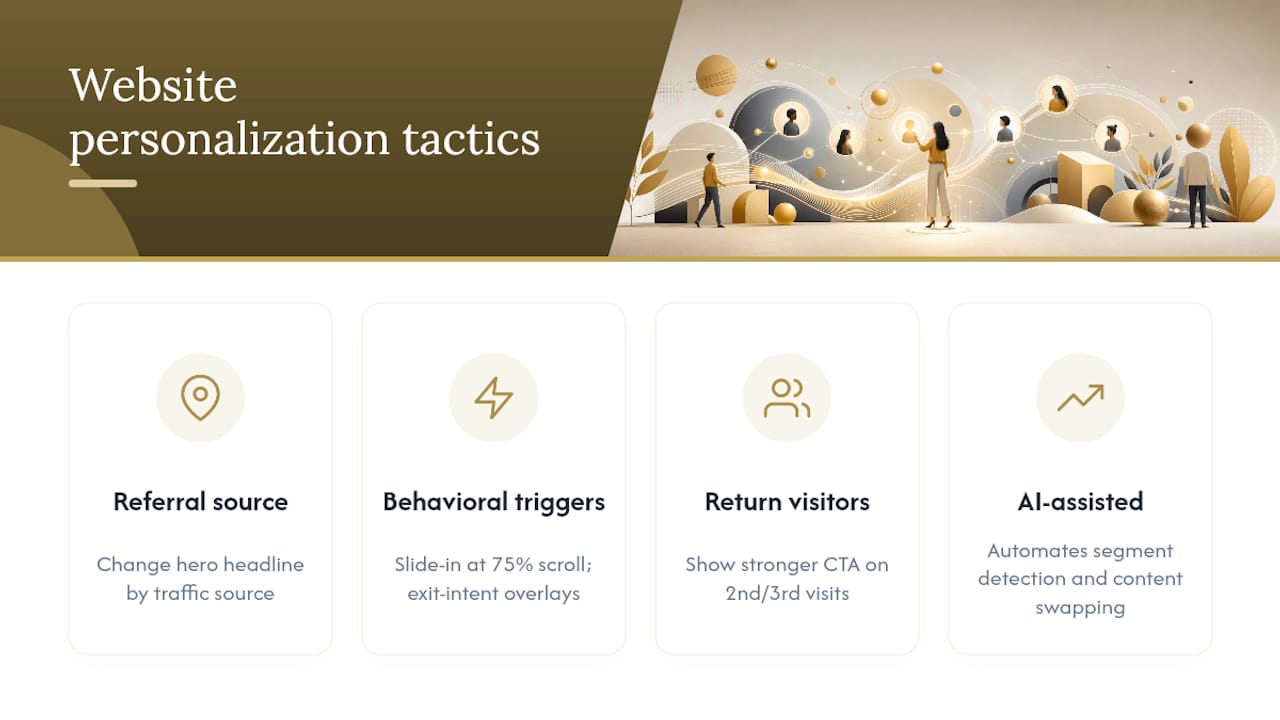
Referral source personalization changes the hero headline based on the traffic source. A visitor arriving from a Google ad for "Indiana contractor websites" sees a headline that matches that query. A visitor from a Facebook ad for a free audit sees a headline about the audit. This message match alone can lift conversion rates on paid traffic significantly.
Behavioral triggers fire based on actions a visitor takes on the page. A visitor who scrolls 75% of the way down a service page without converting is a strong candidate for a slide-in offer (a free consultation, a downloadable guide). Exit-intent overlays work similarly: when the cursor moves toward the browser's close button, a targeted message appears. Used sparingly, these tools capture visitors who would otherwise leave without converting.
Return visitor recognition lets you show a different experience to someone on their second or third visit. A first-time visitor needs education; a return visitor who has already read your services page is closer to a decision and should see a more direct CTA. Tools like Optimizely, VWO, and even some CMS plugins support this without requiring custom development.
AI-assisted personalization is making these capabilities more accessible for smaller teams, with platforms that automate segment detection and content swapping based on behavioral signals.
Customer feedback and user testing as qualitative conversion tools
Analytics tells you where visitors drop off. User testing tells you why. Both are necessary, and most teams underinvest in the qualitative side.
The fastest qualitative methods:
Exit surveys ask a single question to visitors who are about to leave: "What stopped you from [completing the action] today?" Tools like Hotjar and Qualaroo let you trigger this question on exit intent. Even 20 responses reveal patterns that no heatmap can show you.
Moderated user testing puts a real person in front of your site and asks them to complete a task while thinking aloud. Five sessions with people who match your target customer profile will surface more usable insights than weeks of analytics review. UserTesting.com and Maze both support remote moderated sessions.
On-site polls placed on high-exit pages ask visitors what they were looking for and whether they found it. A short two-question poll on your pricing page ("Did you find the information you needed?" / "What's your biggest question about our pricing?") gives you direct input for your next copy test.
Customer feedback from existing clients is equally valuable. Ask your best customers what almost stopped them from buying and what made them confident enough to proceed. Their answers are your trust signal and objection-handling copy, written for you.
Optimize your traffic sources to attract higher-converting visitors
More traffic is not always better traffic. A thousand visitors with low intent convert at a fraction of the rate of two hundred visitors who are actively searching for what you sell. Optimizing your acquisition channels is part of the conversion equation.
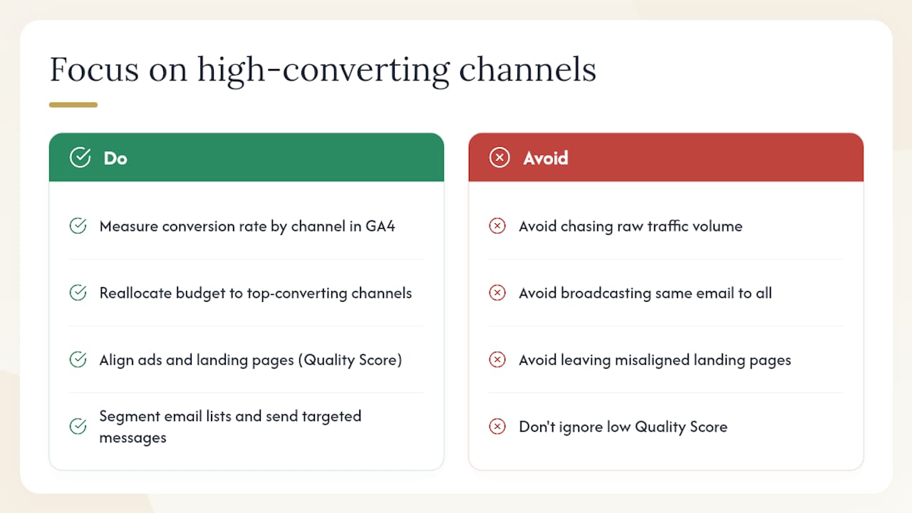
Start with a traffic source breakdown in Google Analytics 4. Compare conversion rates by channel: organic search, paid search, direct, social, email, and referral. You will almost always find that one or two channels convert at two to three times the rate of the others. Put more budget and attention behind those channels before trying to fix the underperformers.
For organic search, the highest-converting pages are usually those targeting specific, high-intent queries ("contractor website design Indiana" converts better than "website design tips"). Audit your top organic landing pages and check whether the page content matches the query's intent. A page ranking for a transactional query but written as a blog post will underperform.
For paid search, Quality Score in Google Ads is a direct proxy for message match. A low Quality Score means your ad copy, landing page headline, and keyword are misaligned. Fixing that alignment improves both your cost per click and your conversion rate simultaneously.
Email remains one of the highest-converting channels for most businesses because the audience already knows you. Segment your email list by behavior (opened but did not click, clicked but did not convert, past customers) and send targeted messages to each group rather than broadcasting the same message to everyone.
Behavioral intent detection at the session level can identify which visitors are in an active buying mode and serve them a more direct CTA, increasing lead volume without additional ad spend.
Key Takeaways
The fastest path to more conversions is fixing speed, sharpening your message, and removing friction before spending on more traffic.
| Point | Details |
|---|---|
| Fix speed and mobile first | Pages loading over three seconds lose more than half of mobile visitors before they see your offer. |
| Set one measurable goal | Pick a single primary conversion action and track conversion rate, funnel drop-off, and CAC against a documented baseline. |
| Test copy before layouts | Headline and CTA changes are the lowest-cost, fastest-feedback experiments; run them before any redesign. |
| Remove form and checkout friction | Fewer fields, guest checkout, and visible total cost reduce abandonment at the highest-value funnel steps. |
| Kirk-co builds for conversion | Kirk-co's hand-coded Indiana websites combine sub-two-second load times, conversion-focused design, and ongoing CRO support in one monthly plan. |
The case for treating CRO as infrastructure, not a campaign
Most teams approach conversion optimization the way they approach a website redesign: a big push, a launch, and then back to normal. That framing is what keeps most sites stuck at 2%.
The businesses that consistently convert at 5% or higher treat CRO as ongoing infrastructure. They have a testing backlog. They review session recordings weekly. They run at least one experiment per month. They update trust signals when they get new reviews. None of this is glamorous, but it compounds. A 10% lift in conversion rate this quarter, followed by another 10% next quarter, produces results that a single redesign rarely matches.
There is also a sequencing mistake worth naming. Many business owners invest in paid ads before their site is ready to convert the traffic. The math rarely works. Fixing your conversion rate first means every dollar you eventually spend on ads goes further. Speed, message clarity, and friction removal are not just CRO tactics; they are the foundation that makes every other marketing investment more efficient.
The quick wins in this article (headline rewrites, form simplification, trust signals) are real and worth doing this week. But the compounding gains come from building a site that is fast by default, easy to test, and designed around a single conversion goal from the ground up. That is where the infrastructure investment pays off.
Kirk-co builds Indiana websites designed to convert from day one
Most local business websites lose leads not because of bad marketing, but because the site itself is slow, generic, and hard to navigate on a phone. Kirk-co solves that at the foundation level with hand-coded, custom websites built specifically for Indiana contractors, home service businesses, retailers, and nonprofits.
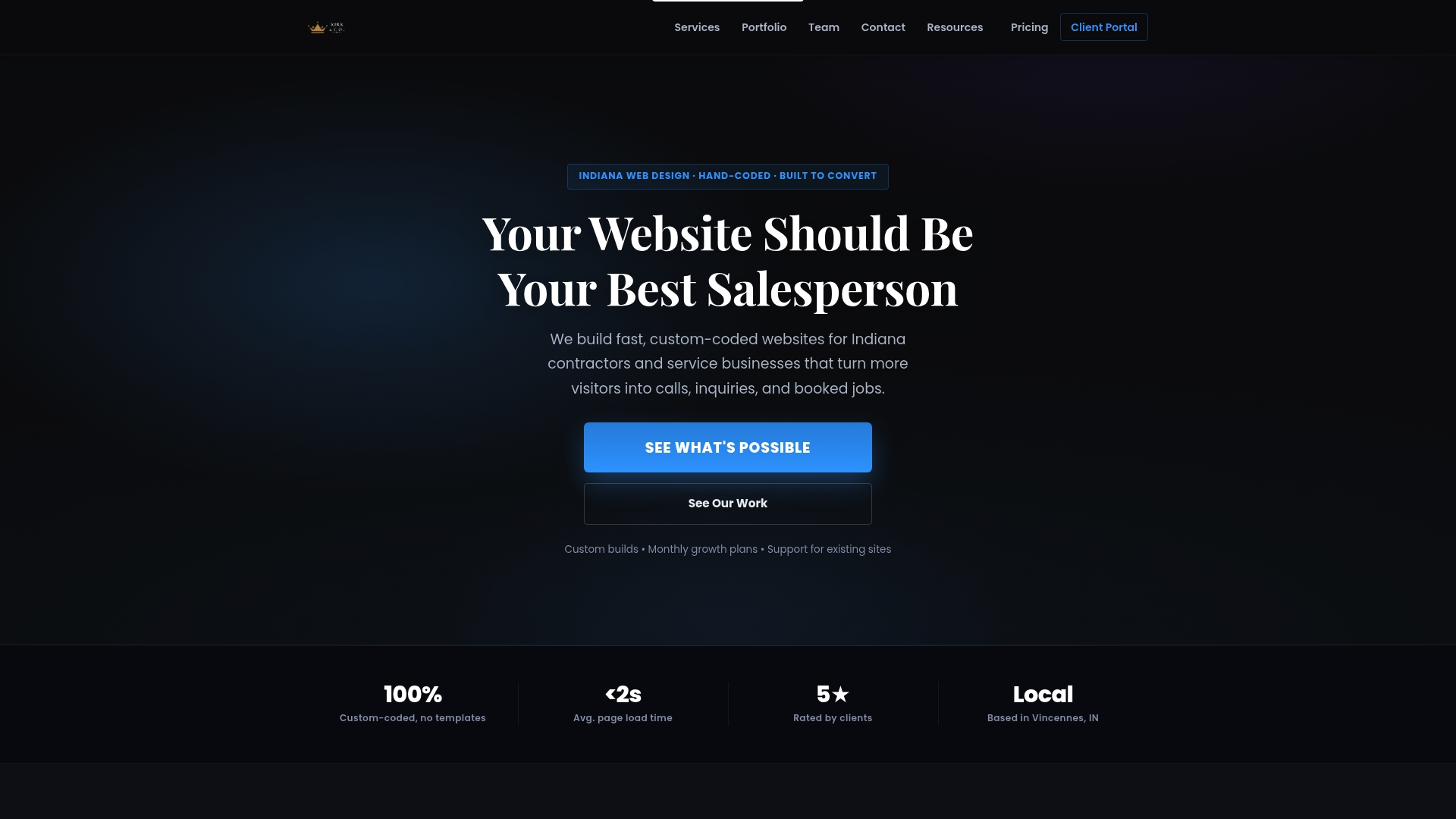
Every site Kirk-co builds loads in under two seconds, passes Core Web Vitals, and is structured around your primary conversion goal from the first line of code. There are no page builder templates, no bloated plugins, and no shared hosting bottlenecks. You get a site that is fast enough to rank, clear enough to convert, and easy enough to update that your CRO work actually sticks.
The monthly website plan includes hosting, maintenance, and ongoing updates so your site keeps improving rather than drifting. If you are ready to see what a custom-coded, conversion-focused website looks like for your business, check Kirk-co's pricing or request a quote at kirk-co.com/pricing.html.
Sources and tools to go deeper
The tools and guides below support the tactics covered in this article.
Performance diagnostics:
- Conversion rate optimization (CRO) strategy for 2026
- 13 Ways to Increase Your Conversion Rate Right Now
- How to generate +60% more leads from your website without paid ads
- How to Increase Online Sales: A Data-Driven Playbook 2026
- How to Improve Conversion Rate on Website: 2026 Guide
- How to Improve Conversion Rate: 26 Proven Strategies
- How to Increase Online Sales: A Data-Driven Playbook 2026
- webpagetest.org
Analytics and behavior tools:
- Google Analytics 4 — funnel tracking, goal completions, and traffic source conversion data
A/B testing platforms:
- VWO — and Optimizely — full-featured experimentation platforms for teams running multiple concurrent tests
Further reading:
- CRO strategy for 2026 (HubSpot) — broad strategic framing and tactic library
- 13 ways to increase your conversion rate (CXL) — disciplined testing methodology and prioritization
- How to increase online sales (Salesforce) — data-driven ecommerce playbook
- AI-assisted CRO tactics for 2026 — modern personalization and automation approaches for conversion teams