
Google uses the mobile version of your site as the primary source for indexing and ranking. That is what mobile-first indexing means in practice, and the transition is complete. Google confirmed in October 2023 that mobile-first indexing has fully landed across the web. If your mobile site is missing content, blocking resources, or showing a stripped-down experience compared to desktop, Google is ranking the incomplete version.
Run these three checks right now:
- Google Search Console URL Inspection: Fetch any key page and review the rendered HTML. Look for missing text, images, or structured data that appear on desktop but not mobile.
- Mobile-Friendly Test: Get a quick pass/fail on usability issues like small tap targets, clipped content, or viewport problems.
- PageSpeed Insights / Lighthouse: Pull your Core Web Vitals scores for mobile specifically. A desktop green score with a mobile red score is a real ranking liability.
Mobile traffic accounts for a majority of global web traffic, so your mobile page is not a secondary concern. It is the page that Google reads, renders, and ranks.
Pro Tip: Run URL Inspection on your homepage AND a deep interior page. Problems often hide on product pages, service pages, or blog posts where templates differ from the homepage.
Key Takeaways
Google ranks the mobile version of your page, so content parity, clean resource access, and strong Core Web Vitals on mobile are the three non-negotiable foundations of mobile-first SEO.
| Point | Details |
|---|---|
| Mobile is Google's primary index | Google uses the smartphone-rendered version of your page for all indexing and ranking signals. |
| Content parity is required | Text, images, structured data, metadata, and internal links must match on mobile and desktop. |
| Blocked resources cause indexing failures | CSS, JS, and images blocked in robots.txt prevent Googlebot from rendering your mobile page correctly. |
| Core Web Vitals are measured on mobile | LCP under 2.5 seconds, strong INP, and low CLS on mobile directly affect your search rankings. |
| Kirk-co builds mobile-first by default | Hand-coded responsive sites eliminate the resource-blocking and parity gaps that template builds create. |
Table of Contents
- How mobile-first indexing works and why it changed your rankings
- Core best practices: content parity, responsive design, and structured data
- Technical checklist to keep Googlebot crawling your mobile content
- Performance and mobile UX that support your indexing
- Common symptoms after a mobile-first shift and how to fix them
- How to test and monitor your site's mobile-first readiness
- How Kirk-co's hand-coded sites solve mobile-first problems
- Why mobile-first indexing shapes how we build every site
- Your next step: get a mobile-first site that works from day one
- Primary sources and tools for deeper reading
- Sources
How mobile-first indexing works and why it changed your rankings
Google maintains a single index. It does not keep a separate mobile index and a separate desktop index. What changed with mobile-first indexing is which version of your page Googlebot fetches and uses to populate that index.
Googlebot now crawls using its smartphone user-agent by default. It renders the page as a mobile browser would, reads the resulting DOM, and extracts content, structured data, metadata, and links from that mobile render. In practice, this has moved beyond "mobile-first" to effectively mobile-only crawling for the vast majority of sites. What Google extracts from your mobile page is what determines your title tags, meta descriptions, featured snippet eligibility, schema markup extraction, and internal link graph.
The practical consequences are significant:
- Rankings: If your mobile page has less text or fewer signals than your desktop page, Google ranks the thinner version.
- Featured snippets: The answer block Google pulls comes from the mobile DOM, not the desktop DOM.
- Structured data: Schema markup present only on desktop is invisible to Google's indexer.
- Internal links: Links that appear only in a desktop sidebar or footer but not in the mobile layout may not be crawled.
Search Engine Land reports that mobile traffic makes up a majority of global web traffic, which reinforces why Google made this shift. The index now reflects how most people actually browse.
Core best practices: content parity, responsive design, and structured data
Google's official guidance is direct: text, images, videos, internal links, metadata, robots meta tags, and structured data must be equivalent on your mobile and desktop versions. "Equivalent" does not mean pixel-identical. It means Google can extract the same SEO signals from both.
Here is the parity checklist to work through:
- Body text: Every paragraph, heading, and list item on desktop must appear in the mobile DOM at render time, not just after a user taps to expand.
- Images: Use the same images or equivalent-quality alternatives. Do not serve a placeholder on mobile where desktop shows a product image.
- Videos: Embed videos on mobile with the same markup. Avoid Flash or formats that mobile browsers cannot render.
- Internal links: Navigation links, contextual body links, and footer links should be present in the mobile layout.
- Metadata: Title tags and meta descriptions must match across versions. A shorter mobile title tag can affect how your snippet appears in results.
- Robots meta tags: If desktop uses
index, followand mobile usesnoindex, Google will not index the page at all. - Structured data: Schema markup (LocalBusiness, Product, Article, FAQ, etc.) must appear on the mobile version with correct, crawlable URLs.
Responsive design is the recommended architecture. A single URL that adapts to screen size eliminates most parity problems by definition. Separate m-dot setups (m.example.com) require careful canonical tag management, redirect logic, and duplicate content handling that creates ongoing maintenance overhead.
Pro Tip: When your mobile design uses accordions or tabs to save screen space, the hidden content still needs to be present in the HTML at page load. Content that only appears after a user taps a button may not be indexed. Verify this with URL Inspection's "View Rendered HTML" feature.
Technical checklist to keep Googlebot crawling your mobile content
Technical problems are the most common reason sites struggle after the mobile-first shift. Google Search Central engineers identify robots.txt blocking and mobile noindex tags as the most persistent post-transition failures. Work through each item below.
- Audit robots.txt for mobile resource access. Googlebot-Smartphone must fetch CSS, JavaScript, and images to render your page accurately. A
Disallow: /assets/rule that made sense years ago can now prevent Google from seeing your page correctly. - Check robots meta tags on mobile pages. Confirm every mobile page uses the same
robotsmeta directive as its desktop counterpart. Anoindexon mobile removes the page from the index entirely. - Verify canonical tags. On responsive sites, the canonical should point to itself. On m-dot setups, desktop pages should canonical to desktop URLs and mobile pages to mobile URLs, with proper cross-annotation.
- Audit mobile redirects. Some sites redirect all mobile traffic to the homepage instead of the equivalent mobile page. Google treats this as a soft 404 and may drop the page from the index.
- Test client-side rendering on mobile. If your site uses a JavaScript framework (React, Vue, Angular), confirm that critical content is present in the initial HTML or loads quickly enough for Googlebot to render it. Use URL Inspection to compare the rendered HTML against the raw HTML.
- Check lazy-loading implementation. Lazy-loading images is fine. Lazy-loading primary text content behind scroll events or user interactions is not. Google may not trigger those interactions during rendering.
- Confirm crawl capacity. If you run a separate mobile site, verify your server can handle Googlebot's crawl rate on that subdomain without throttling.
| Technical Item | Common Problem | Quick Fix |
|---|---|---|
| robots.txt | CSS/JS/images blocked for smartphone Googlebot | Remove or scope Disallow rules; test with robots.txt Tester in Search Console |
| Robots meta tag | Mobile page tagged noindex | Mirror desktop meta directives on mobile |
| Canonical tags | Mobile pages canonical to desktop or vice versa incorrectly | Use self-referencing canonicals on responsive sites |
| Mobile redirects | All mobile URLs redirect to homepage | Map each URL to its correct mobile equivalent |
| Lazy-loading | Primary content hidden behind interaction | Load critical content in initial HTML |
Performance and mobile UX that support your indexing
Speed and usability are not separate from indexing. Google uses Core Web Vitals as ranking signals, and those signals are measured on mobile. A slow mobile experience affects both your rankings and your conversion rate.
The three Core Web Vitals to monitor on mobile:
- LCP (Largest Contentful Paint): Measures how quickly the main content loads. Google's threshold for "good" is under 2.5 seconds. On mobile, large unoptimized hero images are the most common culprit.
- INP (Interaction to Next Paint): Replaced FID in 2024. Measures responsiveness to user input. Heavy JavaScript execution on mobile devices is the usual cause of poor INP scores.
- CLS (Cumulative Layout Shift): Measures visual stability. Ads, embeds, or fonts that load after the page renders and push content around create a poor mobile experience and a poor CLS score.
Image and media strategy matters here. Serve images in WebP or AVIF format, use srcset to deliver appropriately sized images to mobile screens, and lazy-load images that are below the fold. Never lazy-load your LCP image.
For JavaScript, defer non-essential scripts and minimize the critical rendering path. Test your pages with a mobile user-agent in your crawler to confirm what Googlebot actually sees.
On the UX side: tap targets should be large enough and fonts should be readable without zooming, and intrusive interstitials (pop-ups that cover the main content on mobile) can trigger a Google penalty. SiteGround's mobile SEO guide recommends treating Core Web Vitals monitoring as a recurring task, not a one-time fix.
Common symptoms after a mobile-first shift and how to fix them
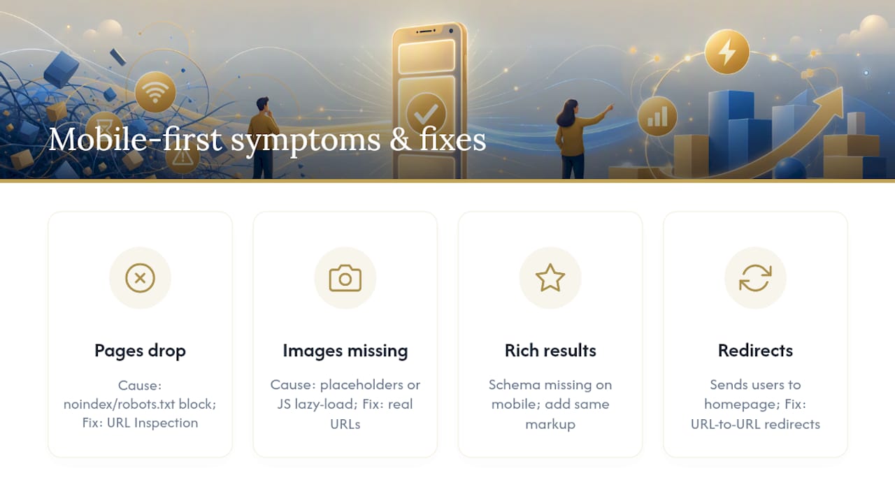
Ranking drops and indexing gaps after a mobile-first transition almost always trace back to a small set of root causes. Here is how to recognize them and what to do.
Symptom 1: Pages drop from the index or stop ranking.
Root cause: mobile noindex tag or robots.txt blocking Googlebot-Smartphone from crawling the page.
Fix: Open URL Inspection in Search Console, check the "Coverage" section, and look for "Excluded by 'noindex' tag" or "Blocked by robots.txt." Mirror your desktop robots meta tags on mobile and update robots.txt to allow access to all rendering resources.
Symptom 2: Images stop appearing in Google Image Search or rich results.
Root cause: Images on the mobile version use placeholder src attributes or are loaded only via JavaScript after user interaction.
Fix: Ensure image src attributes contain real URLs in the initial HTML. Use standard <img> tags with srcset rather than custom lazy-loaders that require scroll events.
Symptom 3: Structured data rich results disappear. Root cause: Schema markup exists on desktop but was not included in the mobile template. Fix: Add the same structured data markup to the mobile version. Use Google's Rich Results Test to confirm extraction from the mobile URL.
Symptom 4: Search Console reports "Page with redirect" or soft 404 errors. Root cause: Mobile redirects sending users (and Googlebot) to the homepage instead of the correct page. Fix: Implement proper URL-to-URL redirects. Each mobile URL should redirect to its exact desktop equivalent, or better, use responsive design to eliminate the redirect entirely.
Pro Tip: Use a comprehensive SEO audit checklist to work through mobile-first issues systematically. Structured audits catch problems that one-off spot checks miss.
How to test and monitor your site's mobile-first readiness
A focused audit workflow is faster and more reliable than a broad site crawl. Google Search Central recommends comparing the rendered DOM on mobile versus desktop because visual parity can hide extraction differences that affect indexing.
Step-by-step verification workflow:
- Verify your site in Google Search Console if you have not already. Add both the www and non-www versions, plus your mobile subdomain if you use one.
- Run URL Inspection on representative pages: homepage, a key service or product page, and a blog post. Click "View Crawled Page" and then "Screenshot" to see what Googlebot saw. Click "View Rendered HTML" to compare the DOM against your raw source.
- Run the Mobile-Friendly Test on the same URLs. Note any usability failures beyond the pass/fail result.
- Run PageSpeed Insights on each URL and filter results to "Mobile." Note LCP, INP, and CLS scores. Flag any metric in the "Needs Improvement" or "Poor" range.
- Crawl with a mobile user-agent using a tool like Screaming Frog or Semrush set to the Googlebot-Smartphone user-agent. Compare the crawl output against your desktop crawl to identify pages or resources that behave differently.
- Check robots.txt with Search Console's robots.txt Tester. Confirm Googlebot-Smartphone can access CSS, JS, and image files.
- Audit structured data with the Rich Results Test on mobile URLs. Confirm schema markup is present and error-free.
| Tool | What It Checks | Where to Find It |
|---|---|---|
| Search Console URL Inspection | Rendered HTML, indexing status, coverage errors | search.google.com/search-console |
| Mobile-Friendly Test | Usability pass/fail, viewport, tap targets | search.google.com/test/mobile-friendly |
| PageSpeed Insights | Core Web Vitals (LCP, INP, CLS) for mobile | pagespeed.web.dev |
| Rich Results Test | Structured data extraction on mobile URLs | search.google.com/test/rich-results |
| Semrush Site Audit | Crawl with mobile user-agent, technical errors | semrush.com |
Ongoing monitoring: Schedule a full mobile audit quarterly and after any major site release. In Search Console, monitor the "Mobile Usability" report under "Experience" and the "Core Web Vitals" report filtered to mobile. Track mobile versus desktop rankings for your primary keywords monthly. Search Engine Journal documents that post-transition issues are almost always technical, so a recurring audit catches regressions before they compound.
How Kirk-co's hand-coded sites solve mobile-first problems
Most mobile-first problems share a common origin: the site was built with a template or page builder that was not designed with Googlebot-Smartphone's rendering behavior in mind. Blocked resources, inconsistent structured data, and slow mobile render times are the predictable result.
Kirk-co builds every site by hand, which means each mobile layout is coded deliberately rather than generated by a plugin. The practical benefits for mobile-first indexing are direct:
- Faster mobile render: No bloated theme files or unused CSS/JS. Only the code the page needs loads on mobile, which directly improves LCP scores.
- Structured data on mobile by default: Schema markup is written into the template, so it appears on every mobile page without a separate plugin managing it inconsistently.
- Clean robots.txt and resource access: Every file the site serves is intentional, so there are no accidental resource blocks for Googlebot-Smartphone.
- Responsive architecture from the start: Kirk-co builds responsive sites rather than separate m-dot setups, which eliminates canonical and redirect complexity.
You can see this approach in action in the R.A.D. Construction project and across the full Kirk-co portfolio. The website performance optimization service also covers existing sites not originally built by Kirk-co, addressing Core Web Vitals, resource access, and structured data gaps.
Kirk-co's hand-coded approach means mobile performance is built in from line one of code, not patched on afterward. For local businesses where a mobile visitor is often a buyer ready to call, that difference shows up in real results.
Why mobile-first indexing shapes how we build every site
Mobile-first indexing is not a technical checkbox for local businesses. It is the operating reality of how customers find you. A contractor, a retailer, or a home service provider in Indiana gets most of their search-driven leads from people on their phones, often within a few miles of the business. If the mobile version of that site is slow, incomplete, or blocked from Googlebot, the business is invisible at the exact moment a buyer is ready to act.

What I see consistently is that businesses underestimate how much technical debt accumulates on mobile when a site is built with a template and never audited. The desktop version looks fine. The mobile version has blocked scripts, missing schema, and a 6-second LCP. Google is ranking the broken version.
Building mobile-first from the start, with clean code and deliberate structure, is not just better for SEO. It reduces the ongoing cost of keeping a site healthy. Every audit cycle is faster, every fix is cleaner, and the site holds its rankings through algorithm updates because the fundamentals are right.
Your next step: get a mobile-first site that works from day one
If you have run the audits in this guide and found gaps, or if you want a site where these problems simply do not exist, Kirk-co builds custom-coded websites for local businesses in Indiana that are mobile-first by design. Fast load times, clean structured data, proper resource access, and responsive architecture are built in, not bolted on.

The path forward is straightforward: request a mobile audit, review what needs fixing, and decide whether a targeted performance fix or a full custom build is the right move. Kirk-co also offers ongoing maintenance plans that keep mobile parity intact through every site update. View the portfolio to see live examples, or reach out directly to get a quote for your project.
Primary sources and tools for deeper reading
Use these resources to verify the guidance in this article and stay current as Google's documentation evolves.
Google documentation and official posts:
- Mobile-First Indexing Best Practices, Google Search Central — the authoritative technical reference for content parity, structured data, and resource access requirements.
- Mobile-First Indexing Has Landed, Google Search Central Blog — Google's announcement confirming the transition is complete.
- Mobile-First Indexing Announcement (2016), Google Search Central Blog — the original announcement explaining the rationale and structured data guidance.
Testing tools to bookmark:
- Mobile-Friendly Test — quick usability pass/fail for any URL.
- PageSpeed Insights — Core Web Vitals scores for mobile and desktop.
- Google Search Console URL Inspection — rendered HTML, indexing status, and coverage errors (access via your Search Console account).
Industry guides and implementation references:
- Search Engine Land: Mobile-First Indexing, Everything You Need to Know — practical best practices and traffic context.
- Ahrefs: Mobile-First Indexing Goes Mobile-Only — operator implications and mobile-only crawling behavior.
- SiteGround Mobile SEO Guide — Core Web Vitals monitoring and mobile optimization recommendations.
- Search Engine Journal: Google Completes Switch to Mobile-First Indexing — post-transition technical failure modes and fixes.
- Mobile-Friendly SEO: Boost Traffic with Technical Tactics — advanced performance-focused tactics and business impact analysis.
Sources
- Mobile-first Indexing Best Practices | Google Search Central
- Mobile-first indexing has landed - thanks for all your support | Google Search Central Blog | Google for Developers
- Search
- Mobile SEO: Complete Guide for 2026 - SiteGround Academy
- Mobile-First Indexing Goes Mobile-Only - Ahrefs
- Mobile-first indexing: Everything you need to know