
For color contrast accessibility, the numbers to know are 4.5:1 and 3:1. Per WCAG 2.2, normal body text must clear a 4.5:1 contrast ratio against its background at Level AA. Large text (18pt or 14pt bold) needs at least 3:1. Buttons, input borders, focus rings, and icons fall under criterion 1.4.11, which sets a 3:1 floor for UI components and graphical objects against adjacent colors.
Your first move: open a contrast checker, paste your foreground and background hex values, and log every pair that fails. Start with these three:
- Body text on your primary background (the pair your visitors read most)
- Primary buttons (background color vs. button label)
- Focus rings (the outline color vs. whatever sits behind it)
Pro Tip: Run your checks before you finalize a color palette, not after. Fixing a failing pair at the token level takes minutes; fixing it after a site is built can mean touching dozens of components.
Key Takeaways
Accessible color contrast starts at the token level: define semantic color roles, grade every foreground/background pair against WCAG 2.2 before building components, and automate checks in CI to prevent regressions.
| Point | Details |
|---|---|
| Core WCAG thresholds | Normal text needs 4.5:1 (AA) or 7:1 (AAA); large text needs 3:1 (AA) or 4.5:1 (AAA). |
| Non-text contrast | UI components and graphical objects must meet 3:1 against adjacent colors under criterion 1.4.11. |
| Token-first workflow | Define semantic color tokens and grade pairings before implementation to prevent regressions. |
| Test every state | Check rest, hover, focus, active, and disabled states separately; focus rings fail most often. |
| Kirk-co | Kirk-co builds WCAG 2.2 AA contrast compliance into every custom site from the token stage forward. |
Table of Contents
- What do the WCAG contrast ratios actually require?
- How is a contrast ratio actually calculated?
- Which contrast tools should you use?
- How do you build accessible contrast into your design workflow?
- What do passing and failing color pairs look like in practice?
- How do you handle transparency, gradients, icons, and other edge cases?
- How do you test contrast on a live site?
- How Kirk-co remediated contrast issues on a client site
- What actually makes color accessibility stick on a team
- Kirk-co builds accessibility into every site from the start
- Sources
What do the WCAG contrast ratios actually require?
WCAG 2.2 organizes contrast requirements into two conformance levels and two text categories. Here is the full picture:
- Level AA, normal text: 4.5:1 minimum
- Level AA, large text: 3:1 minimum
- Level AAA, normal text: 7:1 minimum
- Level AAA, large text: 4.5:1 minimum
- Non-text contrast (1.4.11): 3:1 for UI components and graphical objects against adjacent colors
"Large text" is defined as 18pt (24px) or larger, or 14pt (approximately 18.67px) bold. In practice, that means your H1 and H2 headings often qualify as large text, but your 16px body copy does not.
The 3:1 non-text requirement covers the visible parts of interactive components: the border of a text input, the checkmark inside a checkbox, the outline of a radio button, and the stroke on an icon that conveys meaning. Purely decorative graphics are exempt, but if a user needs to see an element to understand or operate the interface, it needs to pass.
Why does 7:1 exist? WCAG's AAA threshold was calibrated to support users with low vision and age-related contrast sensitivity loss, roughly equivalent to 20/80 vision, without requiring assistive technology. It is a meaningful target for body copy on high-traffic pages, even if you cannot achieve it everywhere.
Level AA is the legal and practical baseline for most U.S. organizations. Section 508 of the Rehabilitation Act and the ADA both reference WCAG 2.0 Level AA as the standard for federal agencies and, through case law, for many private businesses. The Section 508 program at access-board.gov provides training and checklists that restate these ratios and emphasize testing interactive states.
How is a contrast ratio actually calculated?
The ratio comes from relative luminance, which is a measure of perceived brightness rather than hue. WebAIM's contrast guide explains the math: each color is converted to a linear luminance value between 0 (absolute black) and 1 (absolute white), and the ratio is expressed as (L1 + 0.05) / (L2 + 0.05), where L1 is the lighter color. The scale runs from 1:1 (no contrast, identical colors) to 21:1 (pure black on pure white).
The practical implication is that hue tells you almost nothing about contrast. A vivid red (#FF0000) and a vivid green (#00FF00) can look dramatically different to someone with full color vision, yet their luminance values are close enough that the pair fails AA for normal text. WCAG's luminance math works precisely because it ignores hue and measures only brightness, which is what matters for users who cannot perceive color differences.
Pro Tip: When building a scaled palette, use OKLCH or HSLuv instead of HSL. Accessible Palette Studio and InclusiveColors both use OKLCH because its lightness channel is perceptually uniform across hues. Two swatches at the same OKLCH lightness will have similar real-world contrast behavior; two swatches at the same HSL lightness often will not.
HSL is not perceptually uniform. That inconsistency causes palette steps that look evenly spaced in a color picker to produce wildly different contrast ratios in production. OKLCH solves this by anchoring lightness to how human vision actually processes brightness.
Which contrast tools should you use?
Several tools cover different parts of the workflow. Here is a practical breakdown:
WebAIM Contrast Checker is the fastest option for a single pair check. Paste two hex values and you get an immediate pass/fail for AA and AAA at both text sizes. It does not handle transparency or state-aware previews, but for a quick audit it is hard to beat.
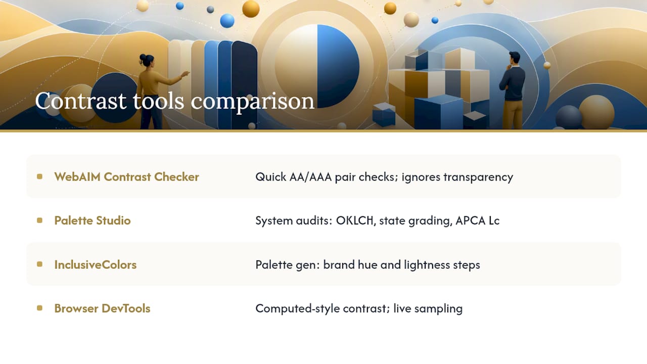
Accessible Palette Studio shines when you are building or auditing a full design system. It uses OKLCH scales, shows state-aware grading (rest, hover, active, focus, disabled), and lets you see APCA Lc values alongside WCAG ratios. That combination catches failures that a simple two-hex check misses.
InclusiveColors is built for palette generation. You define your brand hue, set a range of lightness steps, and the tool shows which foreground/background pairings pass WCAG and experimental APCA checks. It exports tokens for Tailwind, Figma, and CSS, which makes it a natural fit for teams building a design system from scratch.
Browser DevTools (Chrome, Firefox, Safari) include an eyedropper for sampling live colors and a vision deficiency emulator under the Rendering panel. The contrast ratio shown in the color picker reflects the computed style, so it accounts for inherited backgrounds, which standalone checkers cannot do.
Pro Tip: Always test hover, focus, and disabled states separately. A button that passes at rest can fail when its hover background lightens. Accessible Palette Studio's state-aware grading makes this fast; in DevTools, force element states with the :hov panel.
How do you build accessible contrast into your design workflow?
Shifting from "test after design" to "bake accessibility into tokens" is the single change that prevents the most rework. Here is a repeatable workflow:
- Define semantic tokens. Name colors by role (
color-text-primary,color-surface-default,color-border-input) rather than by value (blue-500). This lets you swap a failing value in one place. - Generate your palette in OKLCH or HSLuv. Use InclusiveColors or Accessible Palette Studio to produce a scale where lightness steps are perceptually consistent.
- Grade all foreground/background pairings. Document which token pairs pass AA and AAA. Reject any pair that fails before it enters a component.
- Implement tokens as CSS custom properties. Reference tokens in component styles so a single variable change propagates everywhere.
- Test every interactive state. Check rest, hover, focus, active, and disabled for each component type. Focus rings are the most commonly missed.
- Add automated checks to CI. Run axe-core or Lighthouse in your pipeline to catch regressions before they reach production.
Your design handoff checklist should include:
- A token map showing every semantic color token and its resolved hex value
- A graded pairing table listing approved foreground/background combinations and their ratios
- Focus style specs (color, offset, width) with measured contrast against common backgrounds
- Notes on any brand color that required adjustment and the approved accessible replacement
Pro Tip: Keep your neutral palette small. Three or four approved accessible grays for body copy and borders are easier to audit than twelve near-identical values. Palette drift, where developers introduce slightly different grays over time, is one of the most common sources of contrast regressions.
Understanding how color psychology in web design affects user perception helps when you need to explain palette trade-offs to stakeholders. A brand color that feels warm and inviting may need a darker tint to pass AA, and framing that adjustment as a readability win rather than a brand compromise makes the conversation easier.
What do passing and failing color pairs look like in practice?
Concrete examples make the ratios tangible. The pairs below cover common use cases.
A few things stand out. The pair #767676 on white sits exactly at the 4.5:1 AA floor for normal text, which MDN's color contrast documentation uses as a reference example. Mid-tone blues are a frequent failure point because designers pick a brand blue that looks bold but sits in a luminance range where white text falls below 3:1.
To check a pair in CSS without a tool, you can use the browser console:
// Quick luminance check (simplified)
function relativeLuminance(hex) {
  const rgb = parseInt(hex.slice(1), 16);
  const r = ((rgb >> 16) & 0xff) / 255;
  const g = ((rgb >> 8) & 0xff) / 255;
  const b = (rgb & 0xff) / 255;
  const toLinear = c => c <= 0.04045 ? c / 12.92 : Math.pow((c + 0.055) / 1.055, 2.4);
  return 0.2126 * toLinear(r) + 0.7152 * toLinear(g) + 0.0722 * toLinear(b);
}

function contrastRatio(hex1, hex2) {
  const l1 = relativeLuminance(hex1);
  const l2 = relativeLuminance(hex2);
  const lighter = Math.max(l1, l2);
  const darker = Math.min(l1, l2);
  return ((lighter + 0.05) / (darker + 0.05)).toFixed(2);
}

contrastRatio('#FFFFFF', '#0057B8'); // Returns "7.30"
In production, store your approved pairs as CSS custom properties:
:root {
  --color-text-primary: #1A1A1A;
  --color-surface-default: #FFFFFF;
  --color-brand-blue: #0057B8;
  --color-text-on-brand: #FFFFFF;
}
How do you handle transparency, gradients, icons, and other edge cases?
Several situations make contrast harder to measure correctly.
Alpha and transparency are the most common trap. A semi-transparent overlay does not have a single contrast value. You must measure the composite color, the result of the overlay blended onto its actual background, not the overlay color in isolation. Accessible Palette Studio handles composite rendering; most simple checkers do not. If your design uses rgba or opacity, sample the rendered pixel color with DevTools before logging a pass.

Text over images and gradients requires testing at the extremes. Find the lightest and darkest regions of the image that appear behind text, and test your text color against both. If either fails, add a solid color overlay or a scrim with enough opacity to bring the composite up to ratio. For critical text (navigation, CTAs, error messages), a solid background is always safer than a gradient.
Icons and focus rings fall under WCAG 1.4.11. An icon that conveys meaning (a search magnifier, a close button, a warning triangle) must meet 3:1 against its adjacent background. Purely decorative icons are exempt, but when in doubt, measure it. Focus rings are the most frequently skipped: the ring color must contrast at 3:1 against both the element background and the page background.
Color-only indicators violate a separate WCAG criterion (1.4.1) entirely. If your form validation relies solely on a red border to signal an error, users who cannot perceive red will miss it. Pair color with an icon, a label, or a text message.
Pro Tip: APCA (Advanced Perceptual Contrast Algorithm) produces signed Lc values that treat light-on-dark and dark-on-light differently and adjust for text size and weight. It is not a WCAG conformance standard yet, but running your pairs through Accessible Palette Studio's APCA column alongside WCAG ratios gives you a useful sanity check, especially for small labels and dark-mode palettes.
How do you test contrast on a live site?
A structured inspection covers both manual and automated angles.
Manual steps:
- Open DevTools and use the eyedropper in the color picker to sample foreground and background colors directly from rendered elements.
- Enable the vision deficiency emulator (Chrome DevTools > Rendering > Emulate vision deficiencies) and scan the page for elements that lose meaning under protanopia, deuteranopia, or achromatopsia.
- Navigate the page with keyboard only to expose focus states. Screenshot or record every focused element and check its ring contrast.
- Resize text to 200% and verify that no contrast failures appear from reflow or background color changes.
Automated steps:
- Run axe DevTools or the Lighthouse accessibility audit on primary pages, forms, error states, and data charts.
- Add axe-core to your CI pipeline (GitHub Actions, GitLab CI) so contrast regressions block a pull request before merge.
- Use a site crawler with accessibility reporting for full-site audits before a major release.
Pre-release checklist:
- Home page and primary landing pages: body text, headings, links
- Navigation: default, hover, active, focus states
- Forms: labels, placeholder text, input borders, error messages
- Buttons: all states (rest, hover, focus, disabled)
- Charts and data visualizations: axis labels, legend text, data point markers
- Alert and notification components: text on colored backgrounds
Web accessibility and SEO are closely linked: pages that pass contrast audits tend to have cleaner markup and better readability scores, both of which contribute to search performance.
How Kirk-co remediated contrast issues on a client site
A local Indiana contractor came to Kirk-co with a site built on a template. The brand palette used a mid-tone orange (#E87722) as the primary button background with white text. The measured ratio was 2.8:1, well below the 3:1 floor for large text and far below the 4.5:1 required for normal-weight button labels. A secondary issue: the gray used for form field borders (#BBBBBB on white) returned 1.6:1, failing the 3:1 non-text contrast requirement under WCAG 1.4.11.
The constraints were real. The client's brand guidelines specified the orange, and changing it entirely was not an option.
Remediation steps:
- Audit: Ran a full contrast audit using WebAIM Contrast Checker and axe DevTools, logging every failure with its ratio and WCAG criterion.
- Token strategy: Mapped all colors to semantic tokens. Identified that the orange was used in three contexts: button backgrounds, icon fills, and decorative dividers. Only the first two required contrast compliance.
- Palette adjustment: Darkened the button background token to #C45F00 (a deeper orange that preserves brand warmth) and verified white text at 4.7:1, passing AA for normal text.
- Border fix: Replaced the light gray border token with #767676, reaching exactly 4.5:1 against white, the AA minimum.
- State testing: Checked hover (darkened 10%), focus ring (3px solid #C45F00 with 2px white offset, 3.2:1 against page background), and disabled (opacity 0.4 with a note that disabled states are exempt from 1.4.11 under WCAG).
- Verification: Re-ran axe DevTools and Lighthouse; zero contrast violations on the primary pages.
- Ship: Deployed with CSS custom properties so future color updates flow through tokens, not scattered inline styles.
The decorative orange dividers stayed at the original #E87722 because they carry no meaning and no text sits on them. WCAG's exemption for decorative elements is real, and using it correctly keeps brand expression intact without compromising compliance.
What actually makes color accessibility stick on a team
The teams that get this right are not the ones with the strictest design reviews. They are the ones that make the correct choice the easy choice.
Baking contrast checks into design tokens means a developer cannot accidentally introduce a failing pair without overriding a named variable. That friction is the governance. A code review checklist item that says "verify no CSS color values appear outside of token variables" catches more regressions than a quarterly audit ever will.
When you talk to stakeholders about contrast, skip the legal framing unless they ask. That is a usability argument, and it lands better than citing the ADA.
On the AA vs. AAA question: pursue AAA for body copy on your highest-traffic pages. The jump from 4.5:1 to 7:1 is achievable with a dark-enough text color and a light background, and it costs nothing once it is in your token set. For UI components, AA (3:1) is the practical target; AAA is rarely required and sometimes conflicts with visual hierarchy.
Prioritize remediation by traffic and task criticality. Fix the home page, primary CTAs, and form fields first. Charts and decorative elements can follow. A phased approach with documented ratios is defensible; a site with zero fixes is not.
Kirk-co builds accessibility into every site from the start
Color contrast compliance is not a final-step checklist item at Kirk-co. It is part of the design process for every custom website we build for Indiana businesses. Every project starts with a semantic token system, every palette is graded against WCAG 2.2 AA before a component is built, and every interactive state is tested before launch.
For local businesses that already have a site with contrast issues, our website maintenance and support plan includes accessibility audits, token-based color remediation, and ongoing checks so failures do not creep back in after updates. You get a site that works for every visitor and holds up to scrutiny, without having to manage the technical side yourself. Get a quote or reach out to talk through what your site needs.
Sources
Use these sources to verify rules, explore tools, and go deeper on specific topics: