
A contact page converts when it does three things immediately: gives visitors a short form, shows a real phone number and email they can click, and states exactly when they'll hear back. Skip any one of those and you lose leads to friction and doubt. Everything else on this page, from layout to trust signals, exists to support those three basics.
TL;DR:
- A contact page must immediately display a short form, a clickable phone number and email, and clearly state the response time to convert leads effectively.
- Keep contact information prominently placed in navigation and footer, and match headline and CTA language to avoid breaking visitor intent.
- Limit the form to three fields, use above-field labels, and include trust signals like testimonials or reviews for higher conversion rates.
- Optimize for mobile with vertical stacking, large touch targets, visible labels, and avoid two-column layouts or heavy map embeds to enhance speed and accessibility.
- Show clear response-time promises and implement automated replies, routing, and localizations to build trust and ensure prompt follow-up on inquiries.
Table of Contents
- Contact Page Best Practices: What Belongs on the Page
- Designing the Contact Form: Fields, Labels, and Microcopy
- Layout and Trust Signals That Keep the Form Front and Center
- Mobile, Performance, and Accessibility Essentials
- Trust Signals, Response-Time Promises, and What Happens After Submission
- Contact Page Examples and Templates You Can Adapt Today
- How to Test and Measure Contact Page Performance
- Privacy and Data Protection on Your Contact Page
- Chatbots and Automation for Faster First Response
- Localization and Language Options for Global Audiences
- A Web Designer's Take on What Actually Moves the Needle
- How Kirk & Co Software Builds Contact Pages That Convert
- Sources
Contact Page Best Practices: What Belongs on the Page
Most contact pages fail for a simple reason: they try to do too much. A visitor lands there with one job in mind, reaching you, and every extra distraction pushes them further from finishing it.
Start with what has to be visible without scrolling or clicking. Your phone number should be a tappable tel: link, not just text someone has to copy and dial manually. Your email address needs the same treatment. Visitors expect these traditional contact methods front and center, and hiding them behind a form or chat widget is one of the fastest ways to lose trust, according to NN/g's research on contact page design. People want an escape hatch even if they end up using your form anyway.
Beyond the basics, here's what earns a spot on a well-built contact page:
- Phone number as a clickable
tel:link, formatted for one-tap dialing on mobile. - Email address, ideally also clickable via a
mailto:link. - A short contact form with three fields by default (more on that below).
- Business hours and time zone, especially if you serve customers across regions.
- Service area or physical address, when location affects whether someone can even use your services.
- Department labels, if you route inquiries to sales, support, or billing separately.
Navigation placement matters just as much as content. Your contact link belongs in the main navigation bar and in the footer. Visitors look for it in both places depending on where they are in their decision, and burying it in a dropdown menu costs you clicks you'll never get back.
One detail that trips up a surprising number of businesses: message match. If your headline says "Get a Free Quote," your CTA button should say "Get My Quote," not a generic "Submit." The headline sets an expectation, and HubSpot's review of high-performing contact pages shows that mismatched language between headline and button quietly kills conversions because it breaks the mental thread a visitor was following.
Designing the Contact Form: Fields, Labels, and Microcopy
Every field you add past the essentials is a reason for someone to abandon the page. The data backs this up hard: Shopify's guidance on contact page design shows that trimming a form from four fields to three produces meaningful jumps in completion rates. Fewer fields, more finished forms.
Here's the field structure that works for most service businesses:
- Name — always required, always first.
- Email or phone — let the visitor choose their preferred contact method instead of forcing both.
- Message — a short text area, not a massive box that implies you expect an essay.
- Optional triage dropdown — only if you genuinely route inquiries differently (sales vs. support, residential vs. commercial).
Resist the urge to add a "How did you hear about us?" field. It's a marketing question dressed up as a contact requirement, and it has no business slowing down someone who's ready to reach you. Collect that later, either in a follow-up call or inside your CRM.
Labels belong above each field, not inside it as a placeholder that vanishes the moment someone starts typing. That single design choice affects both usability and accessibility, since placeholder-only labels disappear right when a person needs the reminder most. Use the correct input type for each field. Setting type="tel" and type="email" triggers the right keyboard on mobile, which sounds minor until you watch someone fumble through a standard keyboard trying to type an email address on their phone.
Real-time validation catches mistakes before submission instead of after. If someone typos their email, tell them immediately, not on a failed-delivery bounce three days later.
CTA wording deserves real thought. "Get a Quote" and "Talk to Someone" consistently outperform a flat "Submit," because they describe an outcome instead of a mechanical action. Add a line of reassurance microcopy under the button, something like "We'll respond within one business day. No spam, ever." It costs you one sentence and removes a layer of hesitation.
Pro Tip: Test your CTA button copy against a plain "Submit" for two weeks. The wording change alone often moves completion rates more than any layout tweak you'll make.
Layout and Trust Signals That Keep the Form Front and Center
A contact page has one job, so its layout should make that job obvious the second someone arrives. Single-column forms outperform multi-column layouts almost every time, because a single column creates one clear path for the eye to follow instead of forcing a decision about where to look next.
Whitespace around the form isn't decoration, it's function. It tells the visitor's eye where to go. Pair that with strong color contrast on your CTA button so it doesn't blend into the background noise of your site's color palette.
Trust signals belong close to the form, not buried in a separate section of the page. A testimonial, a review rating, or a client logo placed right beside the form reduces hesitation at the exact moment someone is deciding whether to hand over their information, a point ImpactPlus's review of contact page examples backs up directly.
A few structural choices worth making deliberately:
- Consider trimming or removing global navigation on high-intent contact pages. Fewer exits mean more completions.
- Drop social media icons from the contact page itself. They're an invitation to leave right when you want someone to stay.
- Keep the form above the fold whenever your page content allows it.
- If you include a map, link a static image to Google Maps instead of embedding a heavy interactive iframe.
That last point matters more than it sounds. A live map embed can add real load time for a feature most visitors only glance at once. A static image that opens directions in a new tab gives them the same outcome without the performance cost.
Mobile, Performance, and Accessibility Essentials
More than half your contact page traffic likely arrives on a phone, so mobile experience isn't a secondary concern, it's the primary one. Webflow's guide to contact page design points to vertical stacking as the baseline requirement: every field, label, and button in a single column, no side-by-side layouts that force pinching and zooming.
Touch targets need real size. Buttons and tappable links should measure at least 44 pixels tall, the minimum most mobile design standards recommend for a finger to hit reliably without mis-taps. Anything smaller invites frustration on a small screen.
Run through this checklist before calling your mobile version done:
- Stack every form element vertically, no exceptions.
- Set
type="tel"andtype="email"on the right fields to trigger correct keyboards. - Make touch targets at least 44 pixels tall.
- Avoid two-column layouts entirely on mobile breakpoints.
- Keep labels visible above fields at all times, never placeholder-only.
- Add ARIA attributes to form inputs so screen readers can announce field purpose correctly.
- Use an invisible spam check (like a honeypot field or reCAPTCHA v3) instead of a visible "prove you're human" puzzle.
Accessibility failures on contact forms usually trace back to one habit: treating the placeholder text as the label. A screen reader user who tabs into a field with no visible label above it has no idea what that field wants, and that's a preventable failure with a two-minute fix.
Pro Tip: If you're not sure whether your form is accessible, tab through it using only your keyboard, no mouse. If you lose track of where you are on the page, a screen reader user will too.
On performance, the map embed advice from earlier applies here too: static image, linked out, not embedded. Every extra kilobyte on a contact page is a kilobyte between a mobile visitor on a spotty connection and the moment they actually reach you.
Trust Signals, Response-Time Promises, and What Happens After Submission
The single highest-leverage sentence you can add to a contact page is a response-time promise. "We respond within one business day" does something a form alone can't: it tells the visitor their message won't vanish into a void. Orbit Media's research on contact page performance confirms that this kind of explicit expectation reduces the anxiety that keeps people from hitting submit in the first place.
Put that promise where it can't be missed, directly above or below the CTA button, not buried in a paragraph further down the page.
What happens after submission matters just as much as what happens before it. A generic "Thanks!" message wastes a real opportunity. Build out:
- A confirmation email that restates the response-time promise.
- A thank-you page with clear next steps, like linking to a portfolio, FAQ, or relevant service page.
- Internal routing that notifies the right staff member immediately so the promised window actually gets met.
Speed matters more than most businesses realize. Research on lead response management found that contacting a lead within five minutes dramatically increases qualification rates compared to waiting even a half hour. A promise you can't operationally back up is worse than no promise at all, so make sure your CRM and notification setup can actually deliver on whatever timeframe you advertise.
Contact Page Examples and Templates You Can Adapt Today
Three page structures cover the vast majority of service and retail businesses. Each one adapts the same core rules (short form, visible contact info, response-time promise) to a different visitor intent.
Service lead template. Headline: "Get a Free Quote Today." Subhead: one line naming your service area. Form: name, phone or email, message, three fields total. Below the form: your response-time promise and a single testimonial with a name and photo if you have one.
Support or customer template. Headline: "Need Help? We're Here." CTA: "Send My Message." Add an optional ticket number field only if you already issue them. List your support hours clearly, since support inquiries carry higher urgency than a sales lead.
Retail or visit-focused template. Lead with a static map image linked to Google Maps, hours listed in full, and your phone number in large, tappable text above the fold. Add a booking or reservation link if you take appointments.
| Template | Best For | Core Elements |
|---|---|---|
| Service lead | Contractors, home services, agencies | Headline, short form, response-time promise, testimonial |
| Support/customer | SaaS, subscription businesses, retailers with existing customers | CTA, optional ticket field, listed hours |
| Retail/visit | Storefronts, showrooms, appointment-based businesses | Map image, hours, click-to-call, booking link |
Adapt these rather than copying them outright. A landscaping company and a boutique law office both need a short form and a response-time promise, but the tone, imagery, and trust signals around them should reflect the business, not a template's default styling. For more on wording patterns that consistently lift form completions, CallBack CRM's roundup of high-converting landing page patterns is worth a look, even though it's built around a different industry.
How to Test and Measure Contact Page Performance
You can't improve what you don't measure, and contact pages are easy to instrument well. Track these numbers monthly at minimum:
- Contact page visits compared to total site traffic, to see how many people even reach this page.
- Form completion rate, meaning submissions divided by page visits, not divided by total traffic.
- Time-to-response, measured from submission to first staff reply, checked against your published promise.
- Source attribution, so you know whether leads come from organic search, paid ads, or referral links.
Once you have a baseline, run structured A/B tests rather than guessing. Test field count first (three fields versus four), since that single change tends to produce the clearest lift. Then test CTA copy, and finally trust-signal placement above versus below the form. Change one variable at a time so you know what actually moved the needle.
GA4 funnel reports show you exactly where visitors drop off between landing on the page and completing the form. Pair that with session recordings, which reveal friction numbers alone can't explain, like someone hovering over a field for ten seconds before abandoning it. For a deeper look at applying these tactics across your whole site, Kirk & Co Software's guide to improving website conversions walks through the same measurement principles in more detail.
Privacy and Data Protection on Your Contact Page
Every contact form collects personal information, which means every contact form carries a data protection obligation. A visible link to your privacy policy near the form isn't optional decoration, it's an expectation most visitors now have, and its absence raises a quiet red flag before anyone even starts typing.
If you serve visitors in the European Union, GDPR requires a lawful basis for collecting personal data, plus clear disclosure of what you'll do with it. That typically means a checkbox or statement confirming consent, phrased in plain language rather than legal boilerplate. Even businesses that primarily serve a local or regional customer base should build this habit early, since web traffic rarely respects geographic boundaries as cleanly as a physical storefront does.
Practical steps that cover most of this ground:
- Link your privacy policy directly beneath the form, not just in the footer.
- State plainly what happens to submitted information (used only to respond, never sold or shared).
- Avoid collecting more data than the form needs. A message field asking for a home address when you only need a callback number is a liability, not a convenience.
- If you use a CRM to store submissions, confirm it handles data retention and deletion requests in a way that matches your stated policy.
None of this needs to feel intimidating. A short, honest privacy statement paired with a genuinely minimal form does more to protect you and reassure visitors than a dense legal document nobody reads.
Chatbots and Automation for Faster First Response
Automation fills the gap between "form submitted" and "human replies," and that gap is exactly where leads go cold. A chatbot that instantly confirms receipt, answers a common question, or routes an inquiry to the right department buys you time without making the visitor feel ignored.
The key is scope. A chatbot that tries to replace your contact form entirely usually frustrates visitors who just want to type a message and move on. A chatbot that supplements the form, answering "What are your hours?" or "Do you serve my area?" while the real inquiry routes to a human, earns its place on the page.
Automated confirmation emails deserve the same restraint. Trigger one the instant a form submits, restating the response-time promise and giving the visitor something to do while they wait, like browsing a portfolio or reading a relevant guide. That single automated touch does more to reduce anxiety than any amount of copywriting on the form itself.
Where automation tends to backfire is over-promising. A chatbot that implies instant human response, when the real answer takes a day, erodes the trust a clear response-time promise was supposed to build. Keep automated messaging honest about what's automated and what's still waiting on a person.
Localization and Language Options for Global Audiences
If your business serves customers who speak different languages, your contact page needs to say so clearly, not just offer a hidden language switcher buried in a footer dropdown. Visitors abandon forms fast when they're not sure their message will even be understood.
A visible language selector near the top of the page removes that doubt immediately. It doesn't need to be elaborate. Even a simple toggle between two or three languages, paired with a form that adjusts its labels and microcopy accordingly, signals that you're actually equipped to help.
Time zones matter here too. If your response-time promise says "within one business day," specify whose business day you mean. A visitor in a different region needs that context to know whether "today" means their today or yours.
For businesses operating primarily within a single country or region, full localization may not be necessary, but the underlying principle still applies: match the page's language and expectations to the audience actually filling it out. A confusing mismatch between a page's default language and a visitor's own does the same damage as a missing response-time promise. It introduces doubt at the exact moment you're trying to remove it.
A Web Designer's Take on What Actually Moves the Needle
Most contact page audits start in the wrong place. Businesses obsess over color schemes and font choices while their phone number sits three clicks deep in a hamburger menu. The three quickest wins, in order: put your phone and email in plain sight, add a response-time promise, and cut your form down to three fields. Do those three things before anything else.
You can implement most of this yourself with an afternoon and a decent template. Hire a designer when you need the analytics wiring, CRM routing, and mobile performance work done correctly the first time, since those pieces compound in value the longer a site runs. That's a gap some web design approaches aim to close.
— Elijah
How Kirk & Co Software Builds Contact Pages That Convert
Some web design providers offer alternatives to generic templates or slow agency builds for local businesses that need a contact page working correctly from day one, not after months of back-and-forth revisions. Contact pages often include hand-coded elements with fundamentals such as short forms, visible click-to-call links, response-time promises placed visibly, and analytics for measuring completion rates.
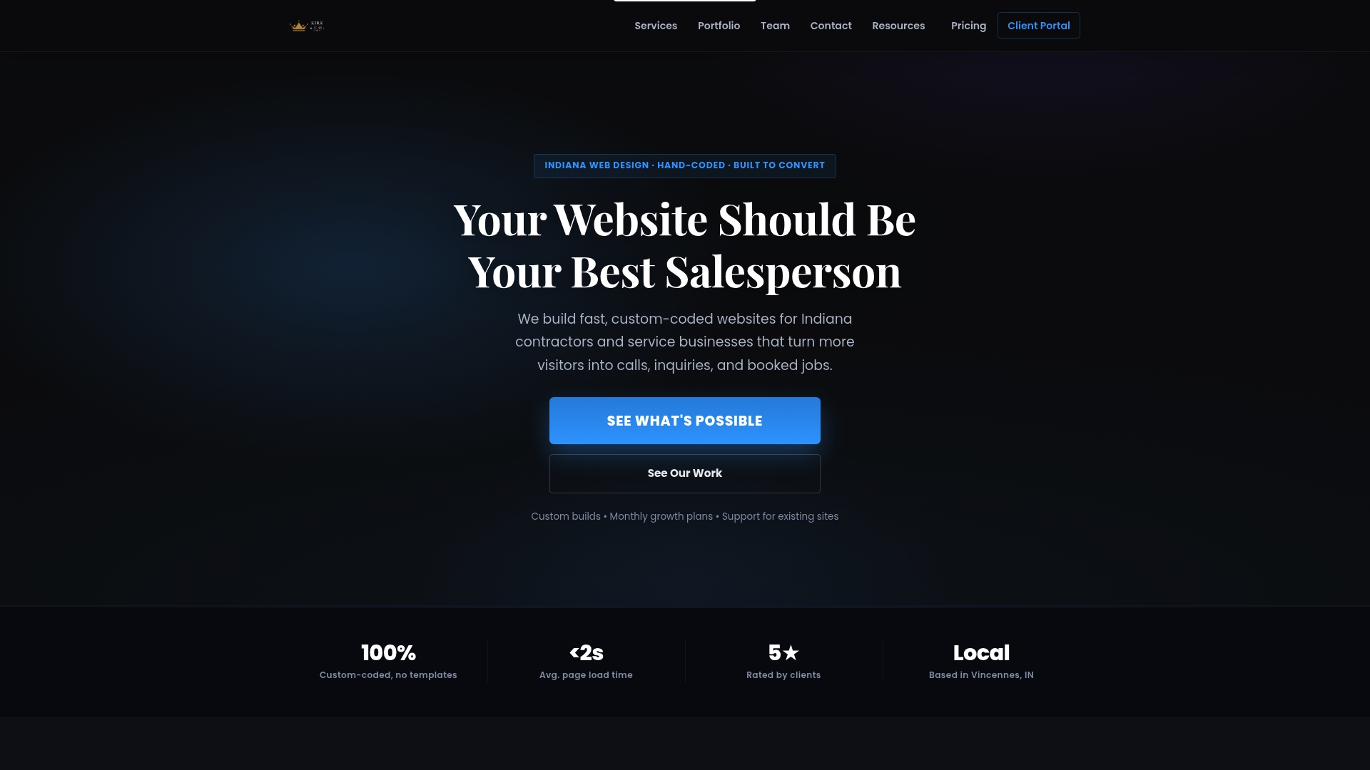
Once a lead comes through, Kirk CRM keeps it moving. Inquiries route to the right person automatically, follow-ups get tracked instead of forgotten, and you can see every open opportunity in one view. It runs $49 a month after a free seven-day trial, built specifically for small service businesses that can't afford a lead falling through the cracks.
If you run a plumbing, HVAC, or landscaping business and your current contact page is costing you calls, take a look at our plumbing company website work or landscaping site builds to see the approach in action, then schedule a free consultation to talk through your specific setup.
Sources
- ‘Contact Us’ Page Guidelines - NN/g
- Contact page best practices - Orbit Media
- Contact Us Page: Examples & How to Create Yours (2026) - Shopify
- Contact us page best practices - ImpactPlus