
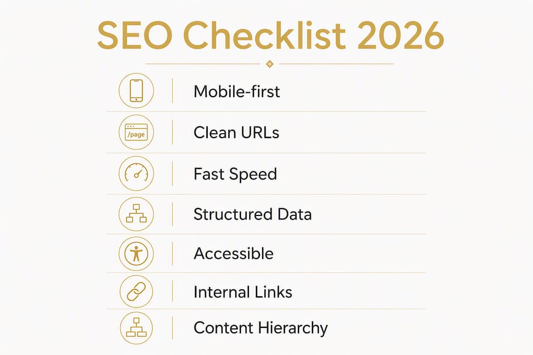
An SEO-friendly web design is a mobile-first, crawlable, semantic site built into your wireframes and component library from day one, not bolted on after launch. Embedding SEO requirements into templates and design systems is consistently faster and more cost-effective than retrofitting them later. Start here: run a mobile render check, run a Lighthouse audit, and confirm every page has exactly one H1.
Your immediate priority checklist:
- Confirm mobile DOM parity: no content hidden from mobile that appears on desktop
- Run Lighthouse on your three highest-traffic pages and note LCP, INP, and CLS scores
- Verify one H1 per page across all templates
- Check that every page has a unique title tag (50–60 characters) and a canonical tag
- Confirm HTTPS is active and no mixed-content warnings appear in the browser console
- Submit an XML sitemap to Google Search Console
- Add JSON-LD structured data to at least your homepage and key service pages
Table of Contents
- What "SEO-friendly web design" actually means
- Why SEO-friendly design matters for your business and users
- Make pages crawlable and indexable: technical checklist
- Site architecture, URL patterns, and internal linking
- Performance: Core Web Vitals and real-world speed budgets
- On-page HTML and content best practices for designers and writers
- Structured data and accessibility: dual benefits
- How to test and measure an SEO-friendly design
- Common pitfalls and red flags that break SEO-friendly designs
- When a hand-coded custom site is the right call
- Key Takeaways
- Design quality and SEO are the same project
- Kirk-co builds performance-first sites for Indiana businesses
- Useful sources and tools for implementation and validation
What "SEO-friendly web design" actually means
The phrase gets used loosely, so here is the working definition: an SEO-friendly website is one that search engine crawlers can discover, render, and index without friction, and that real users can navigate, read, and act on without friction. Those two goals are not in tension; they are the same goal expressed from two angles.
In practice, that means four things are true at the template level before a single piece of content is written. Pages are crawlable: robots.txt and meta directives do not accidentally block important URLs, and internal links form a connected graph rather than isolated islands. Pages are indexable: each URL resolves to a unique canonical document with a correct status code and no conflicting noindex signals. Pages are semantic: HTML elements carry meaning (headings, landmarks, lists, figures) rather than being chosen for visual effect alone. And pages are performance-budgeted: load time and layout stability meet the thresholds Google measures in Core Web Vitals.
The key distinction from "SEO as a plugin" is timing. Adding an SEO plugin to a WordPress site after launch can fix meta tags and generate a sitemap. It cannot fix a heading hierarchy that was built for styling, a JavaScript-rendered navigation that crawlers cannot follow, or a page-weight problem baked into the design system. Those require structural changes, which is why the design phase is the right moment to get them right.
Why SEO-friendly design matters for your business and users
Organic search is still the highest-intent traffic channel most local businesses have access to. A visitor who finds you through a search query is already looking for what you sell. Getting that visibility, though, depends on whether your site gives Google enough signal to rank it and enough speed to keep users on the page.
Design decisions affect rankings more directly than most teams realize. According to industry synthesis, website design accounts for a significant share of ranking factors, covering mobile-friendliness, Core Web Vitals, semantic structure, and crawlability. That share is large enough that a poorly structured design can suppress an otherwise well-written site.
The UX benefits compound the SEO benefits. Faster pages reduce bounce rates. Clear navigation increases pages-per-session. Accessible, readable content keeps users engaged longer, and engagement signals feed back into ranking. The relationship between user experience and organic growth is well-documented: sites that perform well for users tend to perform well in search, because the signals Google measures (speed, stability, engagement) are proxies for user satisfaction.
On timelines: indexing is fast; ranking takes longer. Google can index a new or updated page within days of it being submitted or linked. Ranking improvements from design changes typically take four to twelve weeks to show in Search Console performance data, depending on crawl frequency and how competitive the queries are. Traffic lifts follow ranking improvements, not the other way around. Monitor Search Console's Coverage and Performance reports weekly after a launch or major redesign.
Make pages crawlable and indexable: technical checklist
This is the foundation. Get these wrong and nothing else matters, because Google cannot rank pages it cannot find or render.
Indexability basics:
- One canonical URL per content page; set the
<link rel="canonical">tag in every template, pointing to the preferred URL - robots.txt must not block CSS, JavaScript, or image assets that affect rendering
- XML sitemap includes only canonical, indexable URLs; exclude paginated duplicates, filtered variants, and noindex pages
- All important pages return HTTP 200; redirect chains must be one hop (301 only)
- Meta robots tags default to
index, follow; applynoindexonly to thin, duplicate, or utility pages
Mobile-first indexing:
Google uses mobile-first indexing by default, which means the mobile version of your page is what Google indexes and ranks. Content that exists only on desktop, or that is hidden behind a mobile-only interaction the crawler does not trigger, is effectively invisible. Your mobile DOM must contain the same headings, body text, structured data, and internal links as your desktop DOM. Avoid separate m-dot subdomains unless you have a legacy reason; a single responsive URL consolidates ranking signals and eliminates redirect and duplication risk.
Security:
HTTPS is non-negotiable. Google has used HTTPS as a ranking signal since 2014, and modern browsers actively warn users on HTTP pages. Your TLS certificate must be valid, auto-renewing, and covering all subdomains you serve. Resolve any mixed-content warnings (HTTP assets loaded on an HTTPS page) before launch.
Template-level rules to enforce:
- Every page template outputs exactly one
<h1>tag - Title tags and meta descriptions are unique per page, ideally generated from a template with a content-specific variable, not a site-wide default
- Canonical tags are in the
<head>, not the<body> - hreflang tags are present on any page with language or regional variants
Pro Tip: Run site:yourdomain.com in Google Search after launch. If the count is dramatically lower than your actual page count, you have an indexing problem. Cross-reference with the Coverage report in Google Search Console to identify which URLs are excluded and why.
Site architecture, URL patterns, and internal linking
How you organize pages and connect them determines how authority flows through your site and how efficiently crawlers map it. Both matter for rankings.
URL structure should mirror your topic hierarchy. A clean pattern looks like /services/roofing/ or /blog/category/post-title/. Flat, keyword-relevant slugs outperform long, parameter-heavy URLs. Avoid dates in URLs for evergreen service pages; they signal staleness and complicate future updates.

Keep important content within three clicks of the homepage to avoid orphaned pages and poor crawlability. The three-click rule is a useful design constraint: if a user (or crawler) has to go more than three levels deep to reach a page, that page is probably under-linked and under-valued. Flat architectures with strong internal linking consistently outperform deep hierarchies.
| Architecture Element | Recommended Approach | What to Avoid |
|---|---|---|
| URL depth | 3 levels max for key pages | 5+ levels deep for service pages |
| Slug format | Short, keyword-relevant, lowercase | Auto-generated IDs, dates in evergreen slugs |
| Internal links | Contextual links from hub pages to spokes | Navigation-only links with no body-text links |
| Anchor text | Descriptive, keyword-relevant phrases | "Click here," "read more," generic labels |
| Breadcrumbs | Present on all pages below the homepage | Absent or inconsistent across templates |
| Pagination | Rel=next/prev or self-canonical per page | Infinite scroll with no crawlable fallback |
Internal linking distributes authority and tells Google which pages matter most. Link from high-authority hub pages (your homepage, main service pages) to deeper spoke pages. Use descriptive anchor text that reflects the target page's topic. Breadcrumbs serve double duty: they help users orient themselves and, when marked up with BreadcrumbList schema, they appear in search results as a navigational path.
For paginated content, use self-referencing canonicals on each page and ensure every page in the series is linked from a crawlable index. Infinite scroll without a crawlable fallback (paginated HTML pages or a "load more" button that generates a new URL) means Google sees only the first screen of content.
Performance: Core Web Vitals and real-world speed budgets
Core Web Vitals are Google's three user-experience metrics that directly influence ranking. They measure what users actually feel when a page loads.

| Metric | What It Measures | Good Threshold | Poor Threshold |
|---|---|---|---|
| LCP (Largest Contentful Paint) | How fast the main content loads | — | — |
| INP (Interaction to Next Paint) | How fast the page responds to input | ≤ 200 ms | < 600 ms |
| CLS (Cumulative Layout Shift) | How much the layout shifts unexpectedly | — | — |
These thresholds come from Google Search Central and apply to the 75th percentile of real user sessions, not just your fastest load.
Practical steps to hit these targets:
- Serve images in WebP or AVIF format; use
srcsetandsizesattributes so browsers download the right resolution for the device - Set explicit
widthandheighton every image and video element to prevent CLS from layout shifts during load - Inline critical CSS for above-the-fold content; defer non-critical stylesheets
- Load JavaScript with
deferorasync; audit and remove third-party scripts that are not actively contributing to conversions - Use a CDN with edge caching to reduce server response time (TTFB) below 600 ms
- Preload your LCP image using
<link rel="preload">in the<head>
Testing tools: Lighthouse (built into Chrome DevTools) gives you lab data instantly. PageSpeed Insights combines Lighthouse lab data with Chrome User Experience Report (CrUX) field data from real users. Google Search Console's Core Web Vitals report shows your site's field performance segmented by URL group. WebPageTest gives you filmstrip views and waterfall charts for deeper diagnosis.
Pro Tip: Measure Core Web Vitals on a mid-range Android device over a cellular connection, not just on your development laptop on fiber. Third-party chat widgets, analytics scripts, and font loaders that are invisible in lab conditions on fast hardware regularly push INP and LCP into the "poor" range for real users. Real User Monitoring (RUM) tools like web-vitals.js or your analytics platform's performance module will surface these regressions before they affect rankings.
On-page HTML and content best practices for designers and writers
Every template you ship should enforce these rules by default, so content authors cannot accidentally break them.
Title tags and meta descriptions are your first impression in search results. Title tags should be concise, front-loaded with the primary keyword or topic, and unique per page. A service page title like "Roof Repair in Indianapolis | Smith Roofing" outperforms "Welcome to Smith Roofing" on every axis. Meta descriptions do not directly affect ranking, but a well-written and appropriately sized description improves click-through rate, which does affect ranking indirectly.
Heading hierarchy is one of the clearest signals you can give a crawler about page structure. Use one H1 per page, followed by H2 and H3 in logical order. The H1 should match or closely reflect the page's primary topic. H2s should cover the main subtopics. H3s break down H2 sections further. Never choose a heading level for its visual size; use CSS to style headings independently of their semantic level. A designer who makes an H4 look like an H2 to hit a visual target has broken the document outline for crawlers and screen-reader users simultaneously.
Content shape matters. Open each page with a short, direct answer to the question the page targets. Follow with supporting evidence, then detail. This structure serves both users (who scan before they read) and AI systems (which cite the first clear answer they find). Build editorial areas into your templates with character guidance: a 150-character intro block, defined body sections, and a clear call-to-action zone.
Image rules:
- Alt text should describe the image's content and function, not stuff keywords. "Contractor installing asphalt shingles on a residential roof" beats "roofing roofing contractor Indiana."
- Avoid embedding ranked text in images. Crawlers read the DOM, not pixels.
- Use descriptive, lowercase, hyphenated filenames:
asphalt-shingle-installation.webp, notIMG_4892.jpg - Apply
srcsetso mobile devices download appropriately sized images, not desktop-scale files
Structured data and accessibility: dual benefits
Schema markup and accessibility improvements are often treated as separate workstreams. They are not. Both make your content more machine-readable, and both pay off in search.
Schema priorities by page type:
- Homepage: Organization, LocalBusiness (with address, phone, geo coordinates)
- Service pages: Service, FAQPage (if you include a Q&A section)
- Blog posts: Article, BreadcrumbList
- Product pages: Product (with offers, availability, review aggregates)
- Contact/location pages: LocalBusiness, BreadcrumbList
Use JSON-LD for all schema markup. JSON-LD is Google's preferred format and can be added to the <head> without touching the visible HTML, which makes it easier to maintain and validate. Validate every snippet with the Google Rich Results Test before launch.
Accessibility improvements that strengthen SEO:
- Use semantic HTML landmarks:
<header>,<nav>,<main>,<footer>,<article>,<section>. These give crawlers and screen readers the same structural map. - ARIA roles should supplement, not replace, semantic HTML. Use
role="navigation"only when a<nav>element is not possible. - Keyboard navigation must work for all interactive elements: menus, modals, accordions, and forms. If a user cannot tab to it, a crawler may not trigger it either.
- Color contrast must meet WCAG 2.1 AA standards: a minimum 4.5:1 ratio for body text, 3:1 for large text. Low contrast is both an accessibility failure and a signal that the page may not be optimized for readability.
- Base font size should be at least 16px for body text. Smaller text forces users to zoom, which increases bounce rate.
Validate accessibility with axe DevTools or WAVE before launch. Accessibility improvements directly support SEO compliance by improving crawlability, readability signals, and user engagement metrics.
How to test and measure an SEO-friendly design
Testing is not a one-time event at launch. Build a pre-launch QA checklist and a post-launch monitoring cadence into every project.
Pre-launch checks:
- Run a pre-production crawl with Screaming Frog or a similar tool; check for broken links, duplicate titles, missing H1s, and pages blocked by robots.txt
- Test mobile rendering in Chrome DevTools (device emulation) and in Google Search Console's URL Inspection tool
- Run Lighthouse on desktop and mobile for your homepage, a key service page, and a blog post; target 90+ on Performance, Accessibility, Best Practices, and SEO
- Validate all JSON-LD with the Rich Results Test
- Confirm canonical tags are present and correct on every template
- Check that no staging or development URLs are indexed (block them in robots.txt and with a noindex header during development)
- Verify HTTPS with no mixed-content warnings; test with SSL Labs if needed
- Confirm the XML sitemap is accessible at
/sitemap.xmland contains only indexable URLs
Post-launch monitoring:
- Submit the sitemap in Google Search Console and monitor the Coverage report weekly for the first month
- Check the Core Web Vitals report in Search Console after 28 days of field data accumulates
- Run PageSpeed Insights on key pages monthly; compare against your pre-launch baseline
- Set up crawl-error alerts in Search Console; investigate any spike in 404s or server errors immediately
- Use the URL Inspection tool to fetch and render individual pages; compare the rendered HTML to your source HTML to catch JavaScript rendering issues
Pro Tip: The site:yourdomain.com operator in Google Search gives you a rough index count. Run it weekly for the first month after launch. A sudden drop in indexed pages often signals a robots.txt error or a canonical misconfiguration introduced by a CMS update.
Common pitfalls and red flags that break SEO-friendly designs
These are the mistakes that appear most often in design reviews and post-launch audits.
- Hidden mobile content: Accordions and tabs that collapse content on mobile are fine for UX, but critical text and structured data must be present in the initial DOM, not loaded only after a user interaction. Google's mobile-first crawler may not trigger JavaScript interactions. Keep body text and schema in the DOM; use CSS to show/hide it visually.
- Duplicate or auto-generated meta tags: CMS platforms often generate title tags from page titles with a site-wide suffix. Without a unique, manually reviewed title per page, you end up with dozens of near-identical tags that dilute ranking signals. Audit with Screaming Frog and fix the worst offenders first.
- Canonical errors: A page that links to itself with a canonical pointing to a different URL, or a paginated series where every page canonicals to page one, splits ranking signals. Audit canonicals as part of every template review.
- Heavy third-party scripts: A single unoptimized chat widget or video embed can add significant seconds to LCP on mobile, impacting performance. Load third-party scripts with
asyncordefer, and evaluate each one against its actual conversion contribution before keeping it. - Client-only navigation: Single-page applications (SPAs) that render navigation links only in JavaScript can leave crawlers unable to discover internal pages. Use server-side rendering (SSR) or static generation for navigation elements, or at minimum ensure a crawlable HTML fallback.
- Infinite scroll without pagination: Google cannot scroll. If your blog or product listing uses infinite scroll with no paginated HTML fallback, Google indexes only the first screen. Add numbered pagination or a "load more" button that generates a new, crawlable URL.
- Thin templates: A service page template with only a headline, a short paragraph, and a contact form gives Google almost nothing to rank. Build templates with defined editorial zones that require substantive content before a page can be published.
When a hand-coded custom site is the right call
Most local businesses reach a point where a template-based site stops performing, either because the design cannot be optimized further without rebuilding it, or because the business needs local SEO precision that generic themes cannot deliver.
Situations that justify a custom build:
- Your current site scores below 50 on Lighthouse mobile performance and the theme vendor cannot address it
- You need location-specific landing pages with unique content, schema, and internal linking structures
- Your business category (contractor, home service, nonprofit) requires trust signals, conversion flows, and schema types that templates do not support out of the box
- You are losing leads to competitors whose sites load faster and rank higher for local queries
Kirk-co builds every site by hand, with no page builders or templates. That means the HTML output is clean, the CSS is minimal, and there are no unused plugin scripts adding weight to every page. The process runs from discovery (mapping your services, locations, and keyword targets) through architecture (URL structure, internal linking plan, schema strategy) to component build (heading components, image components with required alt text, FAQ components that output indexable content) and pre-launch QA.
The result is a site built to pass Core Web Vitals on mid-range mobile hardware, structured for local SEO from the first page, and maintained under a monthly plan that keeps it current as Google's requirements evolve. You can see how this approach works across industries, from contractor web design to small business website design, in Kirk-co's live project portfolio.
Key Takeaways
An SEO-friendly web design requires mobile-first architecture, semantic HTML, Core Web Vitals compliance, and structured data built into templates from the start, not added after launch.
| Point | Details |
|---|---|
| Build mobile-first from day one | Google indexes your mobile DOM; content absent from mobile is invisible to ranking. |
| Enforce semantic HTML in templates | One H1 per page, logical heading hierarchy, and landmark elements must be template defaults, not manual fixes. |
| Hit Core Web Vitals on real hardware | Test LCP, INP, and CLS on a mid-range mobile device over cellular, not just a fast desktop. |
| Use JSON-LD schema on every key page | Add Organization, LocalBusiness, FAQPage, and BreadcrumbList markup and validate with the Rich Results Test before launch. |
| Kirk-co builds to these standards by default | Every Kirk-co site is hand-coded for performance, local SEO, and Core Web Vitals compliance from the first line of code. |
Design quality and SEO are the same project
Most teams still treat SEO as a checklist that runs after design is "done." That sequencing is the root cause of most of the problems this article describes. When heading levels are chosen for their visual weight, when images are sized for desktop and scaled down with CSS, when navigation is built in JavaScript because it was easier to animate, the design team has already made SEO decisions. They just made them without knowing it.
The mindset shift is this: SEO constraints are design constraints, no different from brand guidelines or accessibility requirements. A heading component that enforces one H1 per page is not a limitation; it is a specification. An image component that requires alt text before it will render is not friction; it is quality control. When these rules live in the design system and in the acceptance criteria, they get enforced automatically rather than audited manually after the fact.
The practical advice for teams: bring SEO requirements into the design brief alongside typography, color, and layout. When a designer proposes a component, ask how it renders in the DOM, not just how it looks in Figma. When an engineer ships a feature, include a Lighthouse run in the definition of done. When a content author publishes a page, the template should make it structurally impossible to skip the H1 or leave the title tag blank. That is what it means to treat search performance and design quality as one project.
Kirk-co builds performance-first sites for Indiana businesses
Local businesses in Indiana that need a site built to rank, load fast, and convert visitors into leads have a direct option: Kirk-co's custom website development service. Every site is hand-coded, not assembled from a page builder, which means clean HTML output, minimal CSS, and no bloated plugin scripts dragging down your Core Web Vitals scores.
Kirk-co specializes in local SEO from the ground up: URL architecture, schema markup, location-specific landing pages, and internal linking structures built before the first page goes live. Monthly maintenance plans keep your site current as Google's requirements change, so you are not starting from scratch every two years. If you want to see what this looks like in practice, view the Kirk-co portfolio or request a quote directly from the services page.
Useful sources and tools for implementation and validation
- Google Search Central: Core Web Vitals — official thresholds and guidance for LCP, INP, and CLS
- Google Rich Results Test — validate JSON-LD structured data before launch
- PageSpeed Insights — combines Lighthouse lab data with CrUX field data for real-world performance scores
- Google Search Console — Coverage, Performance, and Core Web Vitals reports for post-launch monitoring
- W3C Web Accessibility Initiative (WCAG 2.1) — official accessibility standards referenced throughout this article
- Screaming Frog SEO Spider — pre-launch and ongoing crawl audits for broken links, duplicate tags, and canonical errors
- WebPageTest — filmstrip and waterfall analysis for diagnosing LCP and TTFB issues
- axe DevTools — browser-based accessibility auditing integrated with Chrome DevTools
- Kirk-co website performance optimization — performance audits and Core Web Vitals improvements for existing sites