
Use this website accessibility checklist to find and fix the most common barriers fast. It maps directly to WCAG 2.2 success criteria, so every item you check corresponds to a real, testable standard rather than a guess about what "accessible enough" looks like.
Run these four checks first: color contrast on body text and buttons, full keyboard navigation through your main flows, alt text on every meaningful image, and captions on any video content. A content editor and a front-end developer should own this first sweep together. One catches broken alt text and confusing links; the other catches keyboard traps and missing ARIA. Start with an automated scanner (it flags contrast and missing labels in seconds), then move to manual testing.
Pro Tip: Unplug your mouse and try to complete your site's main task (checkout, contact form, booking) using only Tab, Shift+Tab, and Enter. Then turn on VoiceOver (Mac) or NVDA (Windows) and listen to your homepage. Both take under ten minutes and will expose more real problems than most automated scans.
Key Takeaways
A WCAG 2.2-aligned checklist catches the most common accessibility failures fast, but only manual and assistive-technology testing confirms real conformance.
| Point | Details |
|---|---|
| Target WCAG 2.2 AA | It's backward compatible with 2.1 and 2.0 and adds Focus Not Obscured and Target Size rules. |
| Automated tools aren't enough | Scanners catch missing labels and contrast issues but miss context, semantics, and usability. |
| Test with real people | Include keyboard-only, screen reader, and assistive-technology users in your review process. |
| Assign clear ownership | Content editors handle alt text and captions; developers handle ARIA, semantics, and focus. |
| Kirk-co builds it in from the start | Custom-coded sites and maintenance plans bake accessibility checks into every build and update. |
Table of Contents
- One-Page Printable Website Accessibility Checklist
- How Does This Checklist Map to WCAG Levels?
- Perceivable: Text, Color, Images, and Media Checklist
- Operable: Keyboard, Focus, and Navigation Checklist
- Understandable: Language, Headings, and Error Handling
- Robust: Semantic HTML, ARIA, and Cross-Browser Reliability
- Forms and Interactive Controls: Labels, Instructions, Errors
- What Does a Full Accessibility Testing Workflow Look Like?
- When Should You Run This Checklist in Your Workflow?
- Why a Checklist Alone Won't Guarantee Compliance
- How Kirk-co Builds Accessibility Into Every Site
- Frequently Asked Questions
- Sources
One-Page Printable Website Accessibility Checklist
Print this section or paste it into your QA tool for pre-release gates.
Content
- Every image has alt text, or
alt=""if purely decorative (WCAG 1.1.1). - Headings follow a logical order with no skipped levels (WCAG 1.3.1).
- Link text describes the destination without "click here" (WCAG 2.4.4).
Navigation and controls
- Every interactive element is reachable and operable by keyboard (WCAG 2.1.1).
- Visible focus indicator appears on every focusable element (WCAG 2.4.7).
- A skip-to-content link exists for keyboard users (WCAG 2.4.1).
Media
- Video has synchronized captions; audio-only content has a transcript (WCAG 1.2.2).
- No content flashes more than three times per second (WCAG 2.3.1).
Forms
- Every input has a programmatically linked label (WCAG 1.3.1, 4.1.2).
- Errors are identified in text, not color alone (WCAG 3.3.1).
For tools, run one automated scanner across the full site, then do one manual keyboard and screen-reader pass on your top three pages. Log each row as pass or fail with an owner's name attached, so nothing gets fixed in the meeting and forgotten by the next sprint.
Pro Tip: Turn this list into a shared spreadsheet with columns for WCAG reference, status, and owner. Teams that skip the owner column tend to re-find the same bugs six months later.
How Does This Checklist Map to WCAG Levels?
WCAG 2.2 is the current recommended target, at Level AA, and this checklist is built around it. Sites that conform to 2.2 automatically conform to 2.1 and 2.0, so you lose nothing by targeting the newer version.
WCAG organizes every success criterion under four principles, known as POUR: Perceivable, Operable, Understandable, and Robust. This checklist's sections follow that same structure, so each group of items ties back to one principle instead of floating as an arbitrary rule.
Three additions in 2.2 change what a "complete" audit looks like compared to 2.1:
- Focus Not Obscured — a sticky header or chat widget can no longer hide the element currently in keyboard focus.
- Target Size (Minimum) — clickable targets need at least 24 by 24 pixels of space, per WCAG 2.2.
- Accessible Authentication — login flows can't rely solely on cognitive tests like puzzle-solving or memorized passwords without an alternative.
Pro Tip: When you log an issue, write the exact success criterion number ("1.4.3 Contrast Minimum") next to it, not just "fix the color." Six months from now, that number is what tells a new developer exactly which rule they're fixing and why.
Perceivable: Text, Color, Images, and Media Checklist
Perceivable means a person can actually detect your content, whether through sight, sound, or touch, and this is where most sites lose points first.
Contrast and visual presentation
- Normal text meets a 4.5:1 contrast ratio against its background; large text (18pt+ or 14pt bold) meets 3:1.
- Text resizes up to 200% without breaking layout or hiding content.
- Interactive targets meet the 24×24 pixel minimum introduced in WCAG 2.2.
Alt text and images
- Meaningful images get descriptive alt text ("Golden retriever puppy sleeping on a porch," not "image1.jpg").
- Purely decorative images get
alt=""so screen readers skip them. - Complex images like charts get a longer text description nearby or linked.
Media
- All prerecorded video includes synchronized captions.
- Audio-only content has a full-text transcript.
- Video that conveys visual information not in the audio track includes audio description.
Color usage
- No instruction relies on color alone ("click the green button" needs a label too).
- Charts and graphs use patterns or labels in addition to color coding.
According to research from Baby Love Growth on web accessibility, accessible sites often see SEO benefits too, since many accessibility fixes (alt text, heading structure, descriptive links) overlap directly with what search engines already reward.
For tools, run a contrast checker like the WebAIM Contrast Checker across your palette, then validate captions with a captioning tool before publishing. Automated scanners catch missing alt attributes but not whether the alt text you wrote is actually useful.
Pro Tip: Watch your CMS editor closely. Most WYSIWYG editors let content writers drag in images without ever being prompted for alt text, and some strip semantic heading tags entirely when you paste from Word or Google Docs.
Operable: Keyboard, Focus, and Navigation Checklist
Operable means every control works without a mouse, and this is where the most frustrating accessibility failures live because they block someone from completing a task entirely rather than just making it harder to read.
- Every button, link, form field, and custom widget is reachable and usable with Tab, Shift+Tab, Enter, and Space.
- Tab order follows the visual reading order of the page, left to right, top to bottom.
- A visible focus indicator appears on every focusable element, meeting the "Focus Not Obscured" requirement so sticky headers or modals never cover it.
- Skip links let keyboard users jump past repeated navigation straight to main content.
- Navigation menus stay consistent across pages, and landmark regions (
<nav>,<main>,<header>) are correctly marked up. - Any time limit on a form or session includes a way to extend it or a clear warning before it expires.
Pro Tip: Never remove the default browser focus ring just because it clashes with your design. Design a custom, high-visibility focus style instead. Hidden focus rings are one of the most common reasons keyboard users abandon a site entirely, according to guidance on focus management best practices.
Understandable: Language, Headings, and Error Handling
Understandable content behaves the way users expect it to, so nobody has to guess what a link does or how to recover from a mistake.
- Headings follow a single, logical H1 through H6 hierarchy with no skipped levels.
- Page language is declared in code (
lang="en"), and any foreign-language passages are marked separately. - Link text makes sense out of context; avoid vague phrases entirely.
- Write "Download the 2026 accessibility report (PDF)" instead of "click here."
- Write "View pricing plans" instead of "learn more."
- Write "Enter your email to reset your password" instead of "submit."
Good link text example:
"Read our full website maintenance guide" tells a screen reader user exactly where the link leads before they click it.
Good error message example:
Forms and login flows should also follow the WCAG 2.2 Accessible Authentication rule: no login step should require solving a puzzle or recalling a password from memory without an alternative method available.
Pro Tip: If your form uses a JavaScript-only error message, add an ARIA live region (aria-live="polite") so screen readers actually announce the error instead of silently updating the DOM.
Robust: Semantic HTML, ARIA, and Cross-Browser Reliability
Robust code means assistive technology can parse your site correctly today and keeps working as browsers and screen readers update.
- Use native HTML elements (
<button>,<nav>,<table>) before reaching for ARIA. A real<button>is keyboard accessible by default; a<div>styled to look like one is not. - Only add ARIA roles when native HTML can't express the pattern, and never add a role that contradicts the element's actual behavior.
- Validate that landmarks, heading structure, lists, and table headers (
<th>,scope) are marked up correctly, with no conflictingroleoraria-*attributes. - Confirm the page's HTML parses without errors. Unclosed tags and duplicate IDs regularly break screen reader navigation even when the page looks fine visually.
A
<div onclick="submit()">Submit</div>looks like a button and works with a mouse, but it's invisible to keyboard users and screen readers unless you manually addrole="button",tabindex="0", and a keydown handler. A native<button>gets all of that for free.
Common code fixes worth memorizing:
- Replace clickable
<div>s and<span>s with<button>or<a href>. - Add
scope="col"orscope="row"to every table header cell. - Remove
aria-hidden="true"from any element that also receives keyboard focus.
Pro Tip: Add automated semantic and contrast checks to your pre-commit hooks or CI pipeline. Catching a missing alt attribute in a pull request costs five minutes; catching it after launch costs a support ticket and a rewrite.
Reference WCAG 2.2's technique documents whenever a pattern feels ambiguous. The spec includes failure examples that match almost every code smell you'll encounter in a real codebase.
Forms and Interactive Controls: Labels, Instructions, Errors
Forms cause more accessibility complaints than almost any other page element, mostly because labels and inputs get disconnected during a redesign.
- Every input has a
<label for="id">explicitly tied to itsid, or anaria-labelwhen a visible label isn't practical. - Instructions and hints ("Password must be 8+ characters") are programmatically associated with the field, not just placed nearby visually.
- Required fields are marked with visible text ("required"), not just an asterisk with no explanation.
- Submit the form with an empty required field.
- Confirm the error message appears in text near the field, not only as a red border.
- Confirm a screen reader announces the error automatically.
- Custom controls like toggles and date pickers respond correctly to keyboard input and carry the correct ARIA role and state (
aria-checked,aria-expanded). - Error summaries at the top of long forms link directly to the problem fields.
Correct label pattern: <label for="email">Email address</label><input id="email" type="email">. That single for/id match is often the entire fix for a form a screen reader previously couldn't navigate.
Pro Tip: Test every form by submitting it with the mouse unplugged and your eyes closed. If you can't tell whether it succeeded or failed, neither can a screen reader user.
What Does a Full Accessibility Testing Workflow Look Like?
A reliable workflow layers four checks, each catching what the previous one misses: automated scans in CI, targeted manual audits, assistive-technology smoke tests, and real-user testing sessions.
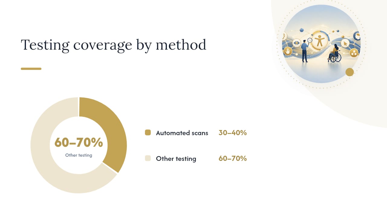
Automated tools like axe DevTools or WAVE catch missing alt attributes, insufficient contrast, and unlabeled form fields quickly, often in under a minute per page. What they miss: whether your alt text is actually descriptive, whether tab order makes logical sense, and whether a screen reader user can understand your page's structure. NCDIT's accessibility checklist is explicit on this point: automated tools flag maybe 30 to 40 percent of real issues, and manual testing has to cover the rest.
A manual pass should include:
- Full keyboard-only navigation through every primary user flow.
- A screen reader walkthrough (VoiceOver, NVDA, or JAWS) of your homepage and top three landing pages.
- Browser zoom to 200% to confirm no content gets cut off or overlapped.
- A caption and transcript review on any video or audio content.
Document every issue with the WCAG success criterion, a screenshot or recording, and clear reproduction steps a developer can follow without asking follow-up questions.
Pro Tip: Add a single accessibility checkbox to your pull request template ("Have you tested this change with keyboard-only navigation?"). It takes ten seconds to check and catches regressions before they ship.
Include actual people with disabilities in usability sessions when you can. Automated tools and even expert manual reviews miss the practical friction that a screen reader user or a person with low vision hits within the first thirty seconds of using your real product.
When Should You Run This Checklist in Your Workflow?
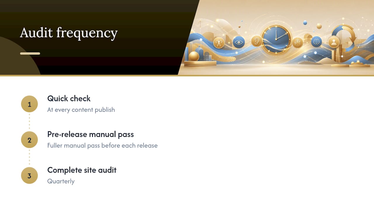
Run it at four points: pre-launch, before each release, at content publish time, and on a recurring quarterly audit. Waiting until launch to check accessibility means fixing dozens of issues at once, under deadline pressure, instead of catching one or two per sprint.
Split ownership clearly. Content editors own alt text, captions, and heading structure inside the CMS. Front-end developers own semantic markup, ARIA, and keyboard behavior. QA owns the manual testing pass before release.
- Sprint planning: add one accessibility ticket per feature that touches the UI.
- Content publish: require alt text and heading checks before any page goes live.
- Pre-release: run the full manual QA pass from the section above.
- Quarterly: audit the whole site for regressions and dynamic content added since launch.
Pro Tip: Build alt text and heading-level fields directly into your CMS templates as required fields. A form that won't publish without alt text prevents more accessibility debt than any policy document ever will.
Why a Checklist Alone Won't Guarantee Compliance
A checklist is a practical QA tool, not a legal guarantee. Passing every item here reduces the most common failures, but full WCAG conformance requires a formal audit against every success criterion, including ones this list simplifies for speed.
Regulatory timelines matter if you serve public-sector clients. The Department of Justice's final rule adopts WCAG 2.1 Level AA as the technical standard for Title II entities, and the ADA's fact sheet lays out staggered deadlines: public entities serving 50,000 or more people must comply by April 26, 2027, and smaller entities by April 26, 2028. These deadlines apply to government and public entities specifically, and private businesses face different obligations under existing ADA case law, so check your own situation before assuming a date applies to you.
Bring in a specialist for complex interactive applications, high legal exposure, or any public-facing service handling sensitive transactions. A formal conformance audit tests every success criterion systematically, something a checklist like this one is not designed to replace.
Pro Tip: Keep an accessibility changelog listing each fix, its owner, the date, and the WCAG reference it addresses. It becomes your evidence of good-faith effort if a complaint ever comes in.
A practical view from building custom sites
Hand-coding a site instead of using a template gives you direct control over every heading, label, and focus style, which is exactly the level of control an accessibility checklist like this one demands. Templates and page builders often bury semantic markup under generic <div> wrappers that make WCAG conformance harder to reach, not easier. Kirk-co builds accessibility checks into new custom builds from the first line of code, and folds ongoing monitoring into maintenance work so fixes don't quietly break during a future update. If you're planning a new site or auditing an old one, that's worth including in the conversation from day one.
How Kirk-co Builds Accessibility Into Every Site
Most template-based builders bolt accessibility fixes on after the fact, which is exactly why so many sites regress within months of launch. Kirk-co hand-codes every site from scratch, so semantic HTML, keyboard access, and proper heading structure get built in from the first commit rather than patched in later.
That means fewer surprises during an audit and fewer regressions when content editors add new pages. Our custom website development work for Indiana contractors, retailers, and home service businesses includes accessibility-aware markup as a baseline, not an upsell. For sites already live, our website maintenance and support plans can include an accessibility review and ongoing monitoring so fixes stay fixed as your site grows. If you want a second set of eyes on your current site or you're planning a rebuild, reach out for a quote and we'll walk through what an audit would cover for your specific pages.
Frequently Asked Questions
What is the difference between WCAG 2.1 and 2.2? WCAG 2.2 adds new success criteria on top of 2.1, including Focus Not Obscured, a minimum target size of 24×24 pixels, and Accessible Authentication rules for login flows. A site conforming to 2.2 automatically meets 2.1 and 2.0 as well, according to the W3C specification.
Can automated tools fully audit my site's accessibility? No. Automated scanners reliably catch contrast issues and missing labels, but they can't judge whether alt text is meaningful or whether a screen reader user can actually complete a task. NCDIT's guidance recommends pairing automated scans with manual and assistive-technology testing every time.
Does passing this checklist mean my site is legally compliant? Not on its own. A checklist reduces common failures but doesn't replace a formal conformance audit, and legal obligations vary depending on whether you're a public entity, a private business, or a nonprofit. Public entities under Title II face specific WCAG 2.1 AA deadlines set by the DOJ's final rule.
Who should own accessibility checks on a small team? Split it by role: content editors handle alt text, headings, and captions inside the CMS, while developers handle semantic HTML, ARIA, and keyboard behavior. QA runs the manual testing pass before each release.
How often should I re-run an accessibility audit? Run a quick check at every content publish, a fuller manual pass before each release, and a complete site audit quarterly. Sites that skip periodic audits tend to accumulate regressions as new pages and features get added.
This article is general information, not a substitute for advice from a qualified lawyer. Consult a qualified legal professional about your own circumstances before acting on anything here.
Sources
The WCAG spec's own "How to Meet" pages include working code examples for nearly every success criterion referenced in this checklist.
- Web Content Accessibility Guidelines (WCAG) 2.2
- Federal Register: Department of Justice final rule (Title II web and mobile accessibility)
- Ada
- Accessibility Checklist for Web Content | NCDIT - NC.gov